VFX supervisor John Kilshaw’s NY team produced the color blossom transformation from initial black and white format, as well as various magic effects and photoreal CG characters like a stork and kaleidoscope of butterflies, on the hit Marvel Studios and Disney+ series.

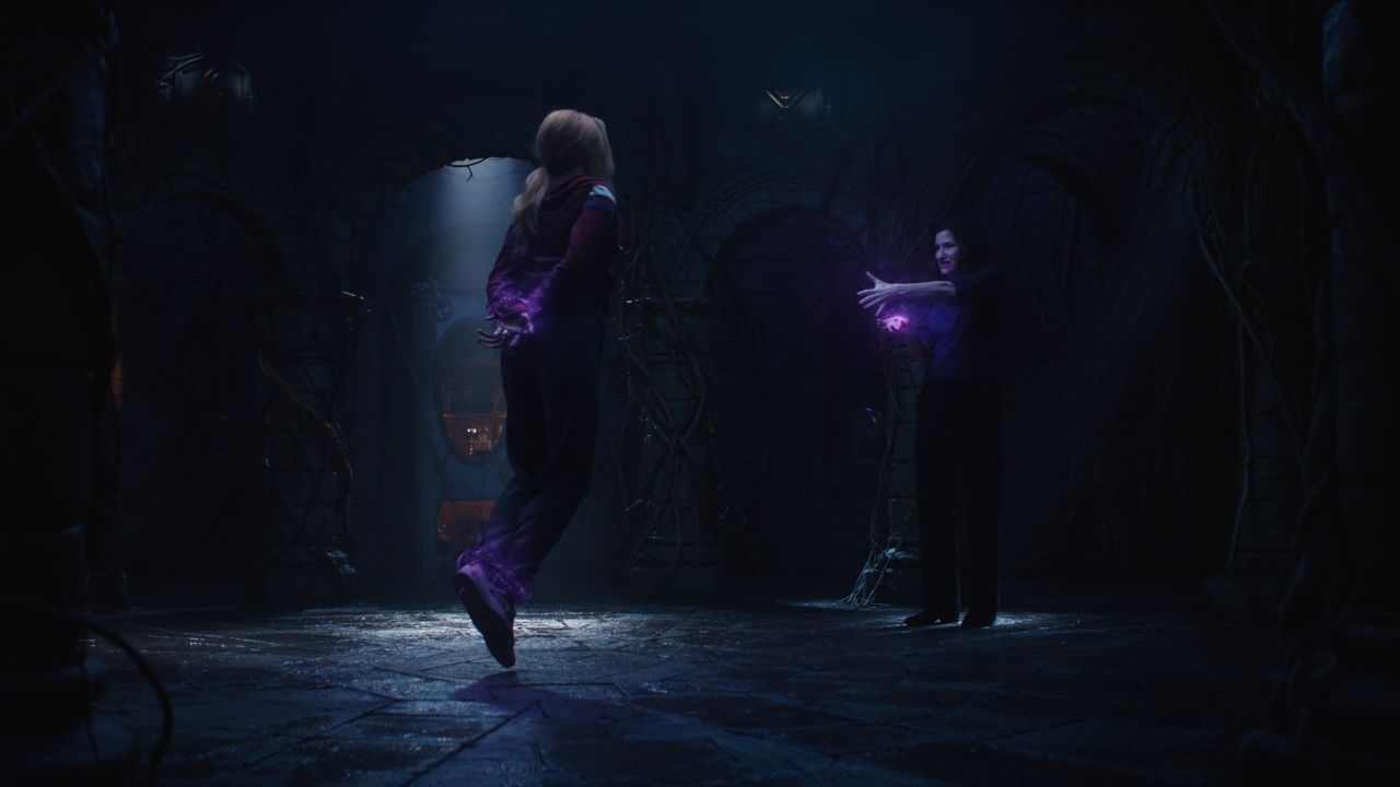
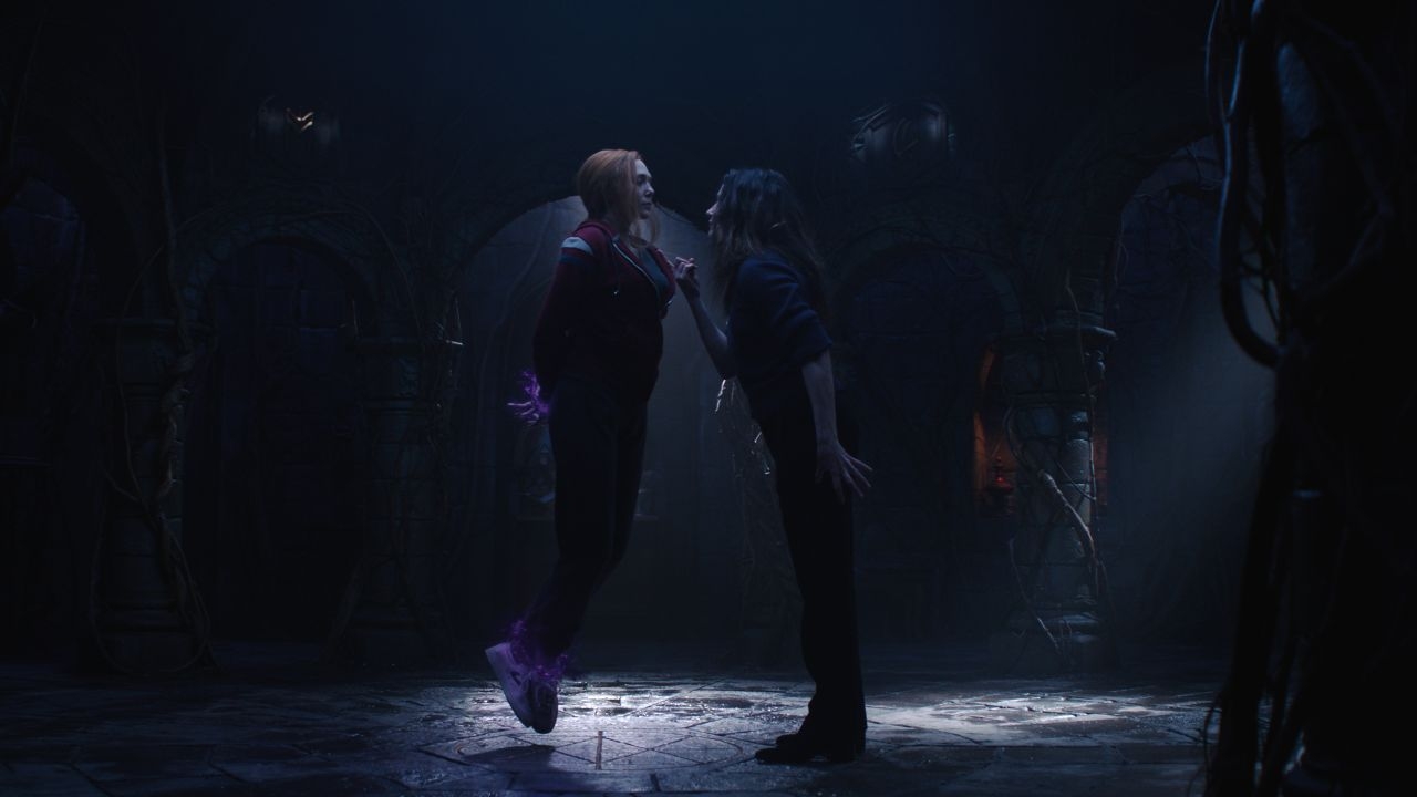
Framestore has shared with AWN four breakdown videos and images highlighting some of their great visual effects work on Marvel Studios’ hit series, WandaVision, now streaming on Disney+. Framestore worked on multiple sequences throughout the nine-episode season, including the Episode 2 color bloom effects, some of Agnes / Agatha’s magic, and a variety of CG animals and insects (a kaleidoscope of butterflies, cicadas, a small bird, and the stork) as well as other elements across episodes 2,3,7, and 8.
According to Framestore creative director and VFX supervisor John Kilshaw, their New York studio was tasked with bringing to life high-end, photorealistic creatures along with scene transformations and magic effects throughout various episodes within the series. “From developing the look and feel of Agatha’s magic, to creating CG characters, and building out a realistic and transformative color blossom effect that would bridge the black and white environment with the new world in color, our team was pleased to see our work appear across the series.”
“We began by having detailed conversations with the client where we brought creative ideas about how we envisioned some of the scenes coming to life,” he explains. “From there, we generated stills and concept art to ensure our visions were completely aligned. A good example of this was the color blossom effect, spearheaded by one of our amazing VFX supervisors, Nick Tanner, where we showcased a range of practical techniques based on optical effects from the period. One of the key references we found ourselves coming back to consistently was the 1960s sitcom, I Dream of Jeannie -- such a credible example of pioneering technology and effects employed at the time.”


“Creating the color blossom featured in Episode 2 was both exciting and challenging, as it was created digitally based heavily on real optical effects,” Kilshaw continues. “The transformation itself went through a series of incarnations, but Nick landed on a relatively simple effect that felt reminiscent of, and paid tribute to, TV shows of the 1950s. He thoroughly researched the way that film was traditionally pressed together and developed during that time to create as much authenticity as possible, and most importantly, tried to ensure we had an appropriate balance of color distortion to match the texture of the period and the signature colors for the rest of the show.”
The process of recreating certain visual styles from iconic 1950s-60s TV, Kilshaw notes, often involved translating old ways of creating content into today’s technology. “The interesting thing about this project,” he says, “was that under usual circumstances our focus would have been on inventing innovative techniques in order to create something new, whereas this show saw us take steps back in time to rethink and redevelop much more traditional techniques in a digital format.”
He adds, “Our North Star was to ensure that the FX utilized in any given scene felt period-authentic to the era being featured. Sometimes this meant intentionally paring back some of the detail that today’s audiences have come to expect, while still maintaining a level of photorealism. Sometimes less is more!”
For example, on the challenging photoreal CG stork, Kilshaw’s team had to create a creature that could credibly perform actions based on the script. “Every vein of each feather was considered, so that when lighting fell off each layer, it allowed for a more interesting and textural dynamic, creating volume rather than simply showcasing a surface of feathers,” he notes.


Reflecting on the overall challenge of working during the pandemic, the VFX supervisor shares, “Framestore’s systems and infrastructure teams were incredibly expedient at adapting to the new remote workflows under COVID, ensuring we had secure connections and an entirely operational team within just a couple of weeks, which luckily meant that there was very little downtime and no impacts on the end quality of our work.”
As the first of a set of highly anticipated new Disney+ series from Marvel Studios that includes the recently premiered The Falcon and the Winter Soldier as well as the upcoming Loki and Hawkeye, WandaVision set the bar high as far as visual design and VFX quality. “It was so important to our team to meticulously consider the MCU canon of characters that have come before those featured in WandaVision so that everything we built felt authentic for fans to be able to enjoy,” Kilshaw says of the challenge to create something unique and special for the show. “The real challenge was that so much of the Marvel canon is set in modern times, yet this story harks back to bygone eras, so striking that balance between respect for the old while reinventing it in the new was constantly at the forefront.”
Reflecting on the breadth of his team’s efforts on the show, Kilshaw remarks, “For me, creating the appearance of Agatha’s magic was a wonderful opportunity. We knew we wanted to capture that same air of retro, period authenticity seen throughout the season, while also factoring in the MCU canon and taking inspiration from the look and feel of Scarlet’s magic. Our focus was on conjuring dark energy that coalesces out of the air around her while always staying connected to the natural world -- and of course, making it as ominous and sinister as possible.”
Dan Sarto is Publisher and Editor-in-Chief of Animation World Network.


