With an exclusive ‘Wishing Star Battle’ breakdown reel to help illustrate, the visual effects supervisor takes us behind the digital curtain, sharing lookdev mandates, design directives, and production realities on how our titular feline hero, as well as the Wolf, Perrito and other characters came to life, on the Oscar-nominated 3DCG animated feature.

Puss in Boots: The Last Wish, arguably, is DreamWorks Animation’s most complete and satisfying film. There. I said it. A critical and box office darling, the film marks a notable departure from the studio’s previous 3DCG animated features in its extensive use of what director Joel Crawford calls a “fairy tale painting” look. Crawford credits production designer Nate Wragg and VFX supervisor Mark Edwards with driving the effort to produce the film’s stunning animation, stating he was “fortunate” to have them on the film. Well, his good fortune is our good fortune too.
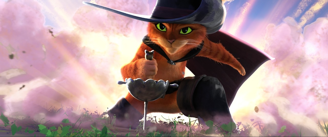
The film’s visual development involved considerable trial and error, countless artists figuring out not just where they could steer the film’s designs, but how they could bend the production pipeline to achieve looks the studio had never before put onscreen. Years of CG animation technology development has meant you can literally see every hair on a cat – Puss has roughly 1.2 million of them. Cue the nostalgic pause to fondly remember all those articles touting the latest advances in fur. But that’s not what Crawford and co-director Januel Mercado were looking for. Along with Wragg and Edwards, they were searching for a storybook aesthetic that allowed them to forge a new style while still meeting audience expectations for a story centered on a beloved feline hero. A “favorite fearless hero” no less. With 1.2 million hairs.
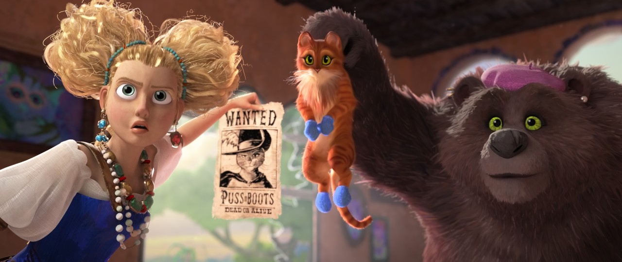
From updating lead character Puss in Boots to introducing new characters like Goldi and the Three Bears and the scene stealing bounty hunter, Wolf – eventually revealed to be Death himself – the production team strove to bring the look of an artist’s touch to the animation, mixing 2D, anime, dare we say toon shading-ish but not really, graphic design elements… an amalgam of styles.
For Edwards, the film’s VFX supervisor, capturing the filmmakers’ vision meant getting an early start on the project. “I came on pretty early,” he says. “On most films, you want a VFX supe on when the art gets going so that you can really strategize around everything you’ll have to translate. So, I've been on [the film] for over three years. That's really where we started. We always look at characters, and there will also be location designs and thoughts.”
But, as you can imagine, early focus also centered around the titular character of Puss in Boots. “We started really early thinking about how to translate Puss,” he shares. “We had a directive, since this is a fairy tale. We always had this idea of a contemporary fairy tale. Everyone brainstormed what that evokes, especially the Western European fairy tale world. And that's where a lot of this painterly idea came from. For Puss himself, it's been over 20 years since Shrek and 11 years since the first Puss in Boots movie. So there was an opportunity to really look at Puss and see how he could be updated.”
“That’s what we started with,” Edwards continues. “Let's take this character, do some look dev… look at art, sketches, and compare his trajectory. In that time stretch [since the last movie], so much had changed at the studio, both with our creatives and with the technology. We can do things we couldn't back then. So that’s where we started. The next step in our lookdev process was taking Puss and doing an animation test.”
Key to these early tests was making sure that however Puss in Boots’ design changed, he still retained his charm, appeal, and unique personality that Antonio Banderas brings to the character. Part of the testing also involved how he looked within the world also being designed at the same time. A perfect fit was critical, as each impacted the other. “Our animation test also involved putting him into the world [of the film],” Edwards explains. “The biggest challenge for us in the film was finding a look that could work with the characters and the environment all together. And as we were exploring both, we had to take approaches from both sides and say, ‘Okay, this isn't working. We need to push hard here and marry the two looks.’”
Much has been written about the film’s unique integration of different visual styles, more the norm in recent films by top studios, but still risky, both in how they support or distract from the story, as well as, from a production standpoint, can they be produced properly within every film’s budget and schedule constraints. Some of the new designs, as Edwards notes, refer to a “painterly” style. Another was a more graphic, 2D, slightly “anime” look, especially for the film’s action sequences.
One of the filmmakers’ tricks was to make ample use of something referred to as stepped-animation, where you don’t have to animate on one frame (ones), but can step through, holding for multiple frames where desired, to give a more stylized look.
“Something we explored early, that turned out working well, was changing the animation step based on the action sequences,” Edwards notes. “Joel and Januel added a little bit of anime flavor, so we could kind of intensify those moments. But originally, we thought about everything on step and with all the intimate moments and everything, it was a conscious choice to go, ‘You know what, this worked better on ones. We should feel the emotion on ones.’ So, there were a lot of conscious choices about when to push the style, even where we really took it far. There's a lot of where we do sort of monochromatic color bursts. But those were very particular moments used very sparsely. I think there's only five really [times that’s done in the film]. They’re key moments and we tried to bookend them for the story. So, everything [done more stylized] was done around the storytelling, at key moments, trying to hit what the directors wanted.”
And of course… there’s the utterly sinister, fantastically nuanced character of the bounty hunter Wolf/Death; he's unique for a DreamWorks Animation film for sure, central to the story but appearing infrequently, sporting a highly graphicly designed look highlighted by incredibly red, steely eyes. In describing the Wolf’s lookdev, Edwards notes that one of the first sequences his team worked on was the “Meet Wolf” intro in the Cantina scene. “We all were really excited because Joel and Januel really, really pushed that scene,” he describes. “I mean, we have our main character bleed, and that was really a first for DreamWorks. I was on How to Train Your Dragon. Hiccup losing a leg was a big thing too. But this was an intense moment. As we saw it all come through story and editing, it was like, ‘This is going to be really intense!’ And fortunately, Margie [Cohn] and Kristen [Lowe] said ‘Go for it.’ So, we were kind of free to really push that. And that was where we explored a lot of different looks.”
He continues, “In particular, we played around with the more graphic feel. Going monochromatic in some ways. But we also did some interesting sort of technical sharpening of wrinkles and CFX to get really graphic lines on him. Even with the 2D design from Jesus [Alonso Iglesias], that sort of diamond pattern, he was a sort of sharp character. So, we softened it a little bit in fur, give him some textural detail. But a lot of that came through in that first sequence. I think the animators explored a lot of his silhouettes and one of the things we added rigging controls for was to give him more of a real big hunch in the back. So those things came along as we were going through that first sequence.”


Then, there are those aforementioned eyes…
“You always worry about doing non-traditional eyes and his are pretty 2D graphic… he doesn't have a traditional iris,” Edwards details. “So, we made sure anim could see all that and get the poses they wanted. But then we blasted… we even did more in color grading to just get these deep red eyes. So that was pretty signature for the character. And as a color scheme, red carries through.”

Speaking of eyes, feast your eyes on this exclusive “Wishing Star Battle” breakdown reel that takes you up close and personal in how the film’s epic final act was developed!
One of Edwards’ main responsibilities was making sure nothing caught his team by surprise, at least not completely. An early start means getting a head start on pipeline and tool testing, as well as figuring out exactly how key visuals will be produced.
As you’d expect, the film’s action sequences tended to be VFX driven. And there were a lot of them. “We knew the big, early Giant fight sequence needed to feel epic in scale,” he reveals. “So, we knew we had a lot of work there. We redid a bunch of the work where he [Puss] was sliding in [to the action], to not just hit the right look, but also the feeling the directors wanted. Just push on all of that. So that was definitely a challenging sequence. And we knew that was going to be tough all along. When we got into the “Pocket Full of Posies” sequence, that ended up being a lot more challenging than we initially thought. We had all these animated flowers, Jack [Horner] comes in and mows them all down, and everything was very tightly edited.”
Noting they had to make sure they could “hit” everything provided in the previs, Edwards adds, “It had a lot of geometric complexity and some surfacing we had to rework, and that was really expensive. So that also ended up being a pretty challenging sequence.”

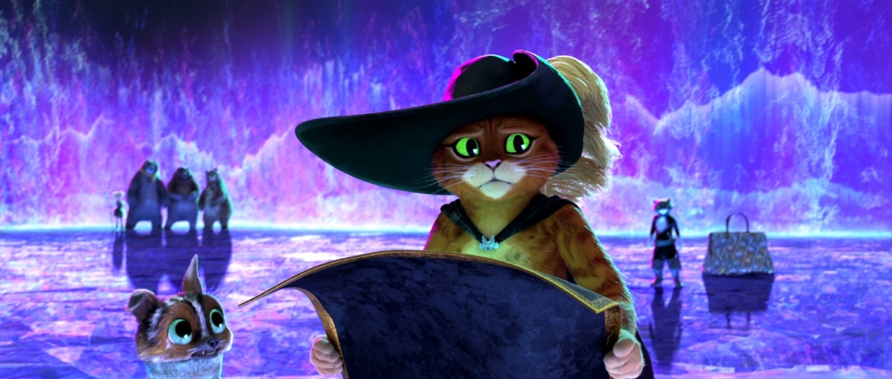
And then, there was the Wishing Star…
“We knew at some point the star was going to be destroyed,” he says. “The star itself was kind of a dev piece. I basically tasked our head of look, Baptiste Van Opstal, with making the star look really, really cool. It was a combination of millions of procedural facets inside it. It has all this depth, and we had to make sure effects could also break it all apart. So that was challenging, but again, we tried to get ahead of that one.”
Edwards always tried to drive the visual effects VFX by sticking close to the underlying artwork. “We really said, ‘Let's try and match this artwork directly,’” he shares. “For example, we had these amazing concept pieces for the deadly aura curtain that comes out when the star lifts out of the crater. Our effects lead K.C. [Kiem Ching Ong] just nailed that, and everyone was just super impressed. I mean, we had to hit the iterate dial, but this was something that just came together. We dropped it in everywhere and it just looked awesome.”
With the visual advances on the animation and VFX front came some tech advances as well, designed to enable and capture more of the artists’ hands on the film. That including how stepped animation was produced. “We had done some stepped animation style here and there,” Edwards says. “VFX simulations in Trolls World Tour were done that way. Bad Guys looked at some of that but didn't use it quite the same way. So, on this show, we had to build our arbitrary stepped animation pipeline. There were two key pieces that really gave us a lot of our look. One we called the stamp map, which effectively could build a point cloud around an object and project texture maps with orientation as sort of any map channel that you wanted. So, you could have brush strokes based on this particle cloud and project all those. And you could plug that into things like the shading normal. One of the things we always were looking at was how could we not just use what the computer gives you, traditionally, and how do we augment that with some handcrafted feeling? That was a really good tool to get brush stroke breakup as lights would shade.”
The second key piece is called “CEO,” a name Edwards lays blame for on effects. “We have a tool called CIA, which stands for ‘Crap in the Air,’” he laughs. “So, we built CEO, which stands for ‘Crap Encapsulating Objects.’ Basically, if you take an object and build a bunch of point clouds around it, if all those sample the closest point material on that object, they can actually lift off the surface and extend, and you can group them to get shapes. It gives you a way to not be beholden to the geometry, but maintain all of your shading. And because it's built, well I guess rendered sort of downstream, you can play with that at any point in the pipeline.”
“Those two pieces gave us so much of the look and we really, really, really tried hard to make sure lighting could control everything,” he adds. “So all of our assets, when they came downstream, they already had a lot of that look baked in and then lighting could just light. That was really effective, and helped us get a cohesive look across the film.”
Overall, Edwards and his team worked diligently to find the balance between the look of the characters and the environments of the world around them. “To begin with, we really wanted to push things, take them too far,” he notes. “But then eventually, we had more concrete direction. ‘Yes, push, but Puss still needs to be soft and fuzzy and appealing the way we know him.’ But that meant everything else had to be pushed on. And that was the biggest hurdle we always faced. Pushing on everything way too far, then going, ‘Okay, let’s relate everything’ and pull some things back. Once we could do that, and get the right level of detail and balance, especially in focus areas, it all came together.”
“But it took us a long time to find that formula,” he adds. “And the good thing is that with other characters, the newer characters, we had a little more freedom. So Perrito, our scruffy dog, we really got to do more brush strokey grooms and things like that. And that was really fun. And the Three Bears are sort of pushed more with their clumps and colors. But Puss… just landing Puss in that environment was pretty tricky.”

Edward sums up his time on the film by noting, “It’s a bit of a departure from traditional DreamWorks films, pushed a lot more. We were really excited that we could do that without losing the emotional beats that can often get watered down. That didn’t happen to us, and that was really exciting. We are all thrilled to see it finished and really happy that folks finally get to see it.”
Dan Sarto is Publisher and Editor-in-Chief of Animation World Network.


