Stop-motion, CG and live action bring the brewmaster’s artful touch to life.
Being part of the in-house team at Moo Studios, I had the privilege of working on the Blue Moon “Artfully Crafted” campaign, collaborating with the ad agency The Integer Group. Brewmaster's Inspiration wasn't the first TV commercial for Blue Moon I worked on. At the beginning of 2012, I was involved in the shooting and post-production of Brewmaster's Touch. Both spots play on the metaphor of the brewmaster as an artist. Brewmaster's Touch shows how the brewmaster, with his magic “Midas touch” turns everything he touches into paintings. The production involved shooting the entire spot in stop-motion shoot, then layering thick, painted brush strokes on top of the footage, to have everything the brewmaster touched shifting into a painted world.
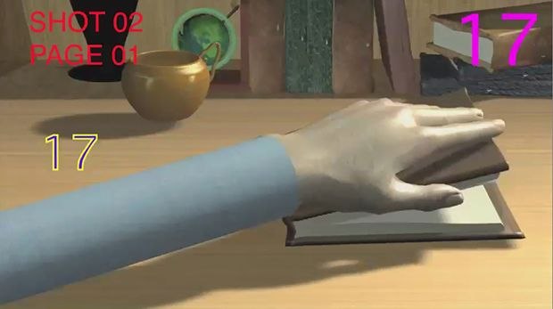
When The Integer Group came to us with a rough storyboard of what the latest spot, Brewmaster's Inspiration, was going to be about, the director Shaun Sewter and I immediately thought it would be a cool, challenging project. Then we asked ourselves, “How the hell are we gonna make this?” The storyboard showed the brewmaster opening a book, wherein on each page, beer bottles, glasses, ingredients and environment elements grew up from the sketches, coming out of the book. They were not photo-real. They lived in the same painted world we saw in the previous spot. Like a pop-up book, they came out of the pages. However, unlike a pop-up book, they weren't made of paper. They were three-dimensional painted objects.


I suggested we take a CG approach to the production. We knew that layering brush strokes on top of live action footage, as we did in the previous spot, would not work this time, since the painted elements had to form from the beginning in their final style. In other words, we would never see real looking oranges or wheat. We would only see them in the painted style. Plus, we were intrigued by the idea of featuring the three-dimensionality of the paintings with a nice, slow camera move lasting for the entire long main shot of the commercial.
We made a motion test to show the agency our approach and to get familiar with the process, which they liked. The test used a mix of stop-motion and CG animation.
One of the most important factors in the “feel” of the spot lies in the stop-motion animation. It helps to give the actors and pages tactile movements perfectly matching the “artfully crafted” image of Blue Moon. We decided that everything except the elements coming to life from the pencil sketches (and the beer kettles in the first and last shot) would be shot in stop-motion.
The first step was to create an animatic. This is always a very important and creative process. It defines timing, camera moving and framing.

The animatic was done entirely in Maya and After Effects. In Maya, we didn't use any footage, only basic models and rigs. I always prefer this approach for the previsualization step as it gives us the freedom to easily re-time each shot according to the agency and client's feedback. Finishing the animatic and getting approvals took us two weeks.
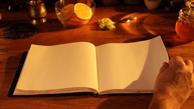
Once the animatic was approved, we shot the first and last shots (the kettles and the background outside the window were added in post) and the whole sequence in the second shot, with the hand opening the book and turning the pages four times. Everything was shot in stop-motion, using Dragonframe.
We used a motion control rig to move the camera by small increments for every frame. That allowed us to shoot multiple passes that later we composited together to achieve a clean plate before starting to add CG elements on top.


We also shot a tracking pass that I used in SynthEyes, creating a camera for import in Maya and After Effects. In this pass nothing but the camera was moving.
![]()
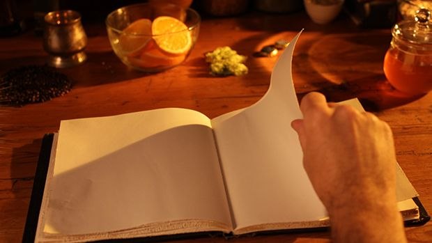
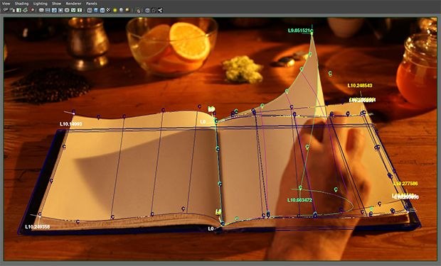
Next, we tracked each page, since all the elements had to sit convincingly on the pages and react to their action.
I manually tracked each page in Maya, using the clean plate of the book as a backplate for the camera, which came from SynthEyes.
Thanks to tracking points on the table and on the book itself, I knew where the book was sitting in space. So, I created four curves for each page, perfectly matching their borders. Then I created a cluster for each vertex of the curves and animated all the clusters through the shotCam (that's what I like to call the render camera), matching all the page turns. Next I used the planar tool to generate the surfaces, perfectly matching the real pages moving. Et voilà!
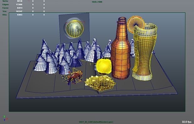
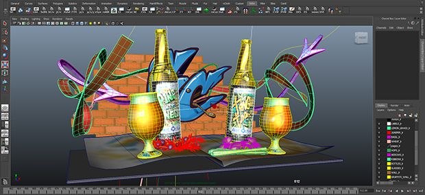
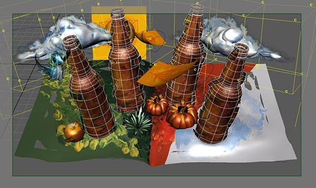
Since the shot with the book was too long to be treated as a single Maya scene, we split it into five segments, one per page. Each page had a different beer selection: Belgian White and the Seasonal, Expressionist, Vintage Ale and Graffiti collections. Each beer collection had a different painting style.
The team of CG artists (Jonathan Bliss, Daniel Edery, Ruta Lauzikaite, Lily Heng, Josh Suyemoto, Shaun Sewter and myself) then built “the magic” coming out of each page of the brewmaster’s book. We modeled and textured all the elements for each page. To break the edges of the otherwise too-clean and CG-looking models, we added planes with brush stroke textures hanging in space close to the models.
We imported all the elements into Maya projects and constrained them to the animated pages.
Each object was revealed by animated opacity that we painted in Photoshop using the UVs as guides. Photoshop has a better brush selection than After Effects and using the built-in timeline, it was fairly easy to create the image sequences we needed. We painted them so the elements would reveal from bottom to top, as they were growing up, directly from the pages.
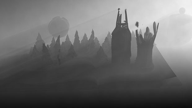
To match the stop-motion feel of the entire spot, we tried to reveal entire brush strokes each frame, as if the artist was painting in a three dimensional space, using the air above the book as a canvas. For the key elements, like the beer bottles and glasses, we used animated maps plugged into the diffuse color of the shaders. Doing so, we could achieve what real painters do, painting different passes on the same portion of the canvas, to get the final artwork. In other words, we see the bottles revealing and then we see the labels painted on.
For some elements, like the ground in the first page, we shot painter Joan Doyle’s real paintings as she created them, using UV printouts as a guide. We shot them in stop-motion on a greenscreen. Once keyed, we used the footage as perfectly matching color and opacity maps for our CG models. This process helped to give the render more realism.
We rendered almost everything in Mental Ray, using nearly flat shaders (high value in the ambient color) since we baked highlights and shadows in the color maps of the elements. The shaders weren’t completely flat because we wanted our three dimensional paintings to react to a virtual lighting setup matching the one used while shooting the hands and the table with the book and all the props.
To achieve a more interesting look and help focus the eyes on the product we were advertising, we also used VRay to create photo-real renders of bottles and glasses so we could composite them with the Mental Ray painting-like renders. As a final touch to the main shot, we added a subtle fog pass that reacts to the turning pages and the five different worlds growing up from them.


Overall, it was a very challenging and fun project. The team of compositors, Shaun Sewter, Bjorn Walters and Alessandro Schiassi, did a great job adding all the different render elements coming from Maya into the several passes shot in stop-motion. Foam and bubbles were composited on top of bottles and glasses to keep the beer alive. I’m happy to say our goal of having stop-motion footage and CG renders living together to create a seamless, organic and tactile look for the “Artfully Crafted” beer was successfully achieved.
--
Sebastiano D’Aprile is a CG artist living in Los Angeles. He can be reached via his website www.sdaprile.com or via email at sdaprile.mail@gmail.com.


