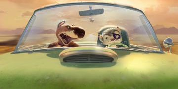
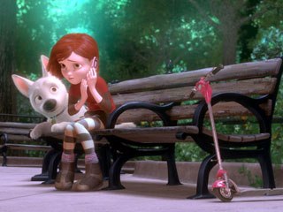
In this month's issue of "The Digital Eye," Hank Driskill, technical supervisor at Walt Disney Animation Studios, tells VFXWorld how Bolt impressively achieved the look of a 2D-painted background in CG.

Going back to its inception as American Dog, Bolt was designed to have a painterly CG look inspired by Edward Hopper and members of the Ashcan school of painting (urban American realism). In fact, the plan was to combine the urban, cinematic look of Hopper with the naturalistic exposure sensibilities of air/atmosphere in the cinematography from the films of the '70s (most notably, Vilmos Zsigmond's McCabe and Mrs. Miller). This included lens effects such as light scattering, blooming and lens flares.
Indeed, applying such a rigorous painterly approach to CG required lots of R&D on the part of the technology team (under the supervision of Hank Driskill). As a result, Disney filed four patents on the R&D done in 2006 and 2007:
- 1. "Multiple Artistic Look Rendering Methods and Apparatus," the massing/editing system.
2. "Method and Apparatus for Graphically Defining Surface Normal Maps," the normal painting technique.
3. Surface Shading of Computer-Generated Object Using Multiple Surfaces," the ray painting system.
4. "Rendering of Shadows with Hand-Painted Appearance," the painterly shadow work.
VFXWorld goes deeper into Bolt's technological accomplishments with Driskill (and you can learn more about them in The Art of Bolt by Mark Cotta Vaz from Chronicle Books).
Bill Desowitz: What was your role on Bolt as technical supervisor?
Hank Driskill: I helped shepherd the R&D on the film, helped supervise all the TDs, worked as the main liaison to the technology groups and, in production I'm kind of the "chief fire fighter."
When we first started our pre-production, the mandate from Paul Felix (our art director) was to be able to make CGI imagery that looked like a painting. That had been done here before with "Deep Canvas" back in the Tarzan and Treasure Planet days, but there the focus had been on brush stroke techniques. Adolph Lusinsky, our Look & Lighting director, was the first to make the observation that you could take a Hopper painting and shrink it to postage stamp size, way too small to see brush strokes, and yet you could still obviously tell it was a painting. This led us to a lot of research on the concepts of massing and editing, being able to control the amount of detail on an object. Look A/look B was our system for massing and editing.
We had our texture painters paint objects in layers: a base coat that's very loose, and levels of detail on top of that. We kept those levels separate, and gave controls to lighters to let them dial in where they wanted detail: they could put detail based on distance (things farther from the eye get looser and more impressionistic, or things farther from some center of interest in the scene), or they could put detail in well-lit areas and not in shadow areas (or the reverse, which creates this nice "blown out" feel to the lit regions).
It gave us a lot of ability to draw the eye where we wanted people to look, especially when combined with more traditional techniques like depth-of-field and such, but also let us work in stereo (where one typically dials down depth-of-field) and still be able to attract a viewer's interest to a particular part of an image.
BD: And how does ray painting fit into this plan?
HD: Ray painting was a technique for putting painterly edges on the silhouettes of objects. Ernie Petti, our lighting supervisor, came up with this idea. We didn't want to have to place thousands of brush strokes on our objects, like "Deep Canvas" had done, but wanted a similar painterly edge. Ernie came up with the notion of placing geometry around an object of interest that would have maps for things like opacity: a ray would be cast from the eye, pick up some properties from the first object and others from the second. We could, for instance, put painterly opacity maps on some surfaces around the main object, and render with the color of the main object and the opacity of the surfaces around it. This gave us a lot of flexibility to play around with the edges of objects at render time, without having to re-model or re-paint the objects. We built "flanges" on things like buildings that would hang off the buildings and give painterly edges, while more complex objects we'd just place cards around the object with opacity maps painted for various viewpoints. It's a little hard to explain, but it was a lot of fun to use and created some really neat silhouettes.
BD: And what did you do differently with normal painting?
HD: The normal painting is pretty straightforward. In videogames, they use normal maps a lot to "fake" detail on simple objects, to make objects look more complex than the actual number of polygons they're shoving around. We turned that idea around, and used normal maps to make our objects look less perfect and CG. We built tools for creating initial normal maps that would soften interior edges on objects, then made it easy for painters to paint normals on an object to make the flat surfaces look like they had brush strokes on them: light would reflect off the surface of a sphere not like it was a sphere, but like it was a sphere covered in brush strokes, or we could make a simple staircase of stairs modeled at right angles look all loose and painterly, by painting normals that would make the edge look less perfect and sharp. It paid off really well, and helped the surfaces and interior edges of objects look like something out of a painting.
With those three, we had a really good toolset. We did a series of tests where we could move through an environment in 3D, but pause on any frame and it would look like a painting. We were really happy with the toolset, but the one thing still "broken" (meaning in this case, too perfect) was our shadows. We'd have these rough silhouettes, rough interior edges, surfaces with detail we could control... and these perfect cast shadows on everything.
BD: So how did you solve this problem?
HD: Chris Springfield and Lewis Siegel built a set of tools that let us "rough up" the different edges of a shadow: the outer edge, the inner edge of the penumbra, as well as give painterly treatments to the shadow itself, through maps a lighter could control. This let us cast shadows that look a whole lot like the shadows in the paintings that Paul had painted as reference, and (again) gave the lighters a lot of control over how they wanted that aspect of the image to look.
BD: What are some of your favorite examples?
HD: Some of the New York City stuff, when you look down the streets, are just really great examples of the ray painting; the normal painting is everywhere and pretty innocuous, as is the massing & editing, I love it especially on really detailed things like trees, 'cause they always look way-too-perfect in CG and in Bolt they really mass up nicely when they're being downplayed in a scene.
That, at the core, is what a lot of this was about: we were aiming for a particular kind of painted look for this film, but we knew we wanted to put together a set of techniques that would give our artists more control over the look of the environment. We can generate a pretty wide variety of looks that we just weren't able to before, by having artist-driven controls over things like surface detail, silhouettes, edge and shadows. We're pretty happy with the look of Bolt; we feel it's got a really rich look that's distinct from other CGI films, but we're also really excited to see how our next films will put these techniques to use.
BD: Paul Felix also mentioned more direct cinematic references. How does this fit in?
HD: We definitely studied both painters and cinematographers, just as Hopper used massing and editing, cinematographers use exposure, atmosphere and depth-of-field to control what the audience is looking at. There are some great scenes in a number of different movies that we studied while talking about how we wanted to control the look of the movie. Adolph and Paul were a huge part of this, of course, since they drove a lot of the artistic desires, and of course, the Disney classics are never out-of-mind, we're always very aware of the legacy we're a part of; we really wanted to make a movie that would be considered beautiful, like we consider those to be.
BD: And John Murrah, the visual effects supervisor, mentioned the influence of matte giant Peter Ellenshaw and attaining some of the same results in CG. How did this fit in with your plans?
HD: We wanted to have a set of tools that would allow us to use matte paintings whenever possible. We have a lot of large environments that you only see for a second or two; CG works great when you spend a lot of time shooting one place, in that respect it's more akin to stage work than film. It's hard to go out on location in a CG movie, and this was first and foremost a travel picture.
BD: And what about the stereoscopic component?
HD: This was also complicated by stereo: we wanted a look that was painterly on the CG elements, and that in turn should have made it easier to blend nicely with matte paintings. But because everything had to be in stereo, we did a lot with projections on simple geometry so even our matte paintings had a lot of depth to them.
We had three distinctions for an environment: a "realized set," which was principally CG; a "box set," which had CG elements in the foreground and a lot of projected paintings on simple geometry in the mid and background; and a "painted set," where the majority of the set was a matte painting, projected out in stereo onto geometry built to catch it and give the appropriate depth cues. Those three are catchphrases, but the reality is more of a continuum: most shots in the movie fall in-between those in some way.
Robert Neuman kept us honest. He was our stereo supervisor, and walked that perfect line, so that the movie never suffered because it was in stereo. The stereo is very immersive and not a gimmick, thanks in large part to Robert, and even our matte paintings look really, really pretty in stereo.
Bill Desowitz is the senior editor of VFXWorld and AWN.


