Author Mike S. Fowler explores element placement in this excerpt from his book all about animation background layout, which includes many illustrated examples and exercises.
As explained throughout this book, the composition, or element placement, is very important to the functionality of any scene.
By placing background elements in various positions the character in front can become lost or constricted for movement. A similar problem can occur when placing elements in front of the character.

To further define the responsibilities of the layout artist, the creation of an atmosphere and environment that a character could freely move and interact within is important. Each project will yield new and exciting solutions, but understand that by using a strong foreground, mid-ground and distant elements do not guarantee a successful drawing.
Foreground
An element that is up close and usually partially illustrated with the remainder of the object situated off the page. The foreground is used in conjunction with the mid-ground and background areas of an environment.
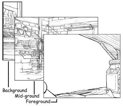
Mid-Ground
In conjunction with the foreground and background areas of an environment, the mid-ground is the main acting stage for the animation to take place. This area must have environmental objects drawn in such a way that they do not interfere with the animation.
An example is taking a picture of a person outside, near a flagpole. If you mistakenly line up the person and the flagpole, the picture will show a person that has a flagpole growing out of the top of his head. Tangential growth is also a concern; lines that run-on and intersect to form one line, on the background and character. By moving the composition the picture becomes clear from obstruction.

Background (BG) or Distant
In conjunction with the foreground and mid-ground areas of an environment, the background is the furthest portion of the environment such as mountains, trees, clouds or stars in space. Generally there is very little detail drawn in this area. The purpose of the distant element is to confirm what the mid-ground has described as the environment.

By combining the foreground, mid-ground and distant levels, a strong visual is created. Using these elements and perspective together creates depth. How the elements are arranged is just as important as what is arranged within a scene. The next step is to develop interest in the composition.

It is sometimes frustrating for a student or at times a seasoned layout artist, to become consumed by the elements of a drawing and create a piece that looks less than acceptable. WHY? When designing an environment add a simple pattern. Patterns that lead the eye throughout the composition create a dynamic drawing. Without it, the drawing is weak.
Each pattern shown here is only a fraction of what can be used. Consider what is presented, as the foundation to a strong composition.


Horizontal Lines: Calm Vertical Lines: Tension Spirals: Mystical Conflicting Angles: Dissodent


Horz/Vert: Enduring Spheres: Sensuous Curves/Waves:Energetic Zig Zag:Excitement


S Curve:Comfort Z curve: Apprehension Arches: Spiritual Triad: Balanced
I have seen many different versions of these patterns from studios such as Disney and Nelvana, to studies of the great masters of design and painting. The concept of pattern is tried, tested and proven to be an effective method of embedding eye candy for the viewer.
Note: Eye candy is a term often used to describe a drawing that controls and creates interest for the person viewing a drawing. Open doors, dark corners, absence of light and winding stairways in a composition direct the viewers eye to keep looking within the drawing. This creates Eye Candy.
Student Work
The reason behind presenting student work in this book came from a decision I made when I put the word student in the title. I believe that it is one thing to read about what a professional has to say on any particular topic, but show me an example of the challenges that one of my peers had, and I will learn faster.
Here are examples supplied by one of my former background layout students, Brian Tolin. The task he was presented was to create a down shot using a third vanishing point of any venue to display depth and pattern.
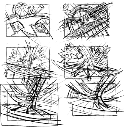
Notice the thought process Brian went through in his developmental thumbnail drawings. Each sketch is based on one main focal point.
His completed composition was derived from elements he extracted from each of the previous thumbnail sketches.

Although the end product was well constructed, the viewers eye tends to travel to the top left hand corner of the screen where an open gate and path flow off the page. Breaking the picture plane is a useful tool to create interest but here it is distracting.

I have manipulated his drawing to adjust the focus to the truck.
Note: All compositional experimentation must be done during the thumbnail stage of creation. Minor refinement can be completed during the drawing of the full sized blue rough artwork. Before you start to draw ask, What is the focal point of this drawing? Build your patterns around this concept.
Design your background (BG) with the character in mind. If the character cannot physically fit into the layout, or is interfered by objects within the layout, change it! Thoroughly plan out your scene in the thumbnail stage. As you complete the blue roughs for the full size layouts and poses, continue to consciously observe your work for any new problems.
Animation Background Layout: From Student to Professional by Mike S. Fowler. Caistor Center, Ontario, Canada: Fowler Cartooning Ink, 2002. 168 pages. ISBN: 0-9731602-0-9. $35.00. Buy it online at Mikes Website.
Mike S. Fowler has a passion for art and animation. His animation abilities as a supervisor, layout artist, poser, storyboard artist and fun pack designer are showcased in numerous shows. Credits include: Bob and Margaret, Neds Newt, Hoze Houndz, Elliot the Moose, Little Bear, Eckhart, Maggie and the Ferocious Beast, Rainbow Fish, Anthony Ant, Franklin, Redwall, Ace Ventura and Blazing Dragons, to name a few.
In addition to being a published political and panel cartoonist, graphic artist and classical animation graduate from Sheridan College, Mike has supervised various Flash Web series, promotional bumpers for major television shows and segments of an educational Flash-HTML based university learning program for U.S. and Canadian markets.
Mike has developed, from concept through to production, several critically acclaimed montage/demonstration films, artists showcase books and educational promotional material.
Fowlers educational background covers Graphic and Advertising Design at Conestoga College, a diploma in Classical Animation from Sheridan College, Management and Human Relations at Conestoga and Sheridan Colleges, and a Certificate in Adult Education from the University of New Brunswick. As the lead animation college instructor, he teaches animation, layout, storyboard, Flash and computer graphics.
With the release of his first book, Animation Background Layout: From Student to Professional, Mike adds being a published author to his list of achievements. Read more about Mike.


