Tara DiLullo Bennett talks to production designers and art directors for three of the summer's biggest blockbusters, Ratatouille, Pirates of the Caribbean: At Worlds' End and Transformers about the role of concept art in their productions.
. All Ratatouille images © Disney Enterprises Inc. and Pixar Animation Studio")
When audiences choose to spend their hard earned money on a movie ticket for one of the latest super-sized, effects-laden, summer blockbusters, they aren't thinking about how the CGI bells and whistles come to life on screen. They just want to see and believe the amazing explosions, the towering robots, the foodie rats running around a kitchen or the ghostly galleon battling the swirling elements, really could be real.

For the hundreds of people working behind the scenes creating that make-believe, that's their greatest reward -- the audience accepting their art as reality. But there happens to be a lot of steps to eventually get to that place in darkened theater somewhere in the world. With summertime releases, the stakes are always higher and the competition is fiercer to get audience eyes and make back the incredible budgets invested into making the films. With price-tags soaring into the $200 million range for some blockbusters, the producers and the filmmakers do everything they can to maximize their pricey visual effects budgets, making sure they plan as much as possible so as not to waste precious funds on poor execution. And one of the most helpful tools in that process is concept art.
With the time and talents of exceptional designers and illustrators being utilized very early in the film pre-production process on concept art, directors are able to create visual blueprints for the production and post-production teams to follow throughout the process. Director-commissioned concept art created at the start of a film can obliterate most of the confusion that can appear when, say a 3D modeler is unsure of how a character should ultimately look, or when the vfx team isn't exactly sure how an expensive CGI environment will work with certain camera angles. The guessing just adds time to the post-production calendar and bloats budgets already beyond capacity. Concept art not only takes out the uncertainty, but it also helps the entire team coalesce around a united vision that streamlines the process further.
VFXWorld talks to production designers and art directors for three of the summer's biggest blockbusters, Ratatouille, Pirates of the Caribbean: At Worlds' End and Transformers, to discuss the function of concept art in their productions.
Harley Jessup -- Production Designer, Ratatouille (Pixar)
Tara DiLullo Bennett: Concept art has always been an important part of traditional animation, but does it serve the same role now in the world of 3D animation?
Harley Jessup: I think it does. It serves different purposes throughout the different phases. During pre-production and development, I always think of it as a preview of where's its going and the possibilities. It's interesting because some of the artwork from the very beginning of the film often looks more finished than the artwork that we are doing at the end. By that time we have outlined the way the world looks, so later on we are into plans, views, and elevations -- our more practical model-building guide for the technical director. In the beginning we are really trying to inspire a back and forth thing between the art department and the story department. It keeps building in a very exciting way.
.")
TDB: As you are honing and defining that merging of story with design, how long does the animation conceptual art phase last before you get into production?
HJ: The main production priority during pre-production is the character design. It takes them a long time to be modeled and articulated. Plus they want to get into animation tests as soon as they can. That stretches out for a couple years in the beginning. The first year, we were working hard to get a character line up that the director liked and the story team liked. After a year-and-a-half, it was a stake in the ground that the main characters were drawn in the way the director liked them. During the end of that time, we would get into sculpts of the characters. I always feel like working in 3D it's a real important step to get into sculpts early because on our show, sculptors Greg Dykstra and Jerome Ranft add an enormous amount of their design expertise as the characters are being developed in 3D. [The concept art] becomes a really great guide for the modelers as they are building each character. Even before we have a character built in the computer, we have an image that looks like the final model, that's all shaded.
TDB: How have new digital tools improved concept art in general these days and help bridge the gap between concept and animation?
HJ: More and more of the artwork is being done digitally. Some people bemoan that it's not all-traditional art anymore. We were kind of famous for the idea of doing traditional sculptures and painting and pastels in traditional media. Now it is at least half and half. I look at the way that programs like Adobe Photoshop are being used, especially, and each artist is able to work in their own style using the various techniques and tools built into it so you can get any look that you want. I've worked on two films at Pixar, .")
Another one of the tools we used on Ratatouille was the previs set process; I found it to be really useful. It's used different ways on different shows at Pixar, sometimes mainly as a technical production tool, but, on Ratatouille, we used it as an important design tool. Early on, I would do a rough ground plan with simple elevations of a set, say the sewer or kitchen. Simon Dunston and Brian Christian would build a very simple model in Maya based on those plans and we would get a really good preview of what the set was going to be like. We could walk the director through it and get lots of good information about changing doors or ceilings, etc. There are always changes and it's so much easier to make those changes early on in a previs set. By the time we needed go into production, the director and story department had bought off on the layout. It was a huge advantage especially towards the end of production when it was running like a big locomotive and we just had to go.
TDB: Has concept art really become a subset of previs now?
HJ: I think of design pre-vis as part of the concept art tool set. Conceptual art will run through the whole production schedule but at the very beginning we'll do loose sketches. I would do layout for a painting and [artist] Dominique Louis would take that and do a wonderful pastel or digital painting. As soon as we had previs models, Dominique would paint over those. The previs modelers were able to project some simple lighting that really helped Dominique. He is brilliant at lighting effects and we'd get a gorgeous preview of what the set might look like before the models were built. That preview proved to be the wonderful advantage of the design previs process.
.")
TDB: Since believable wine and food and the more lush-looking Paris environments play significant roles, how did this impact the shaping of the concept art?
HJ: To create the food, I realized we needed to actually cook and photograph each dish featured in the movie. Our art department manager at that time, Michael Warch, had been a professional chef. He served as our in-house food consultant along with our key consultants, chefs Thomas Keller and Michael Hung. Then the modeling, effects and lighting groups each made a huge contribution to the look of the final food. We designed the Paris sets through concept paintings, set plans, design previs and the actual modeling process.. In different versions of the story, Paris would play a bigger or a smaller role and I'm really glad that it wound up being featured in several sequences. I think it helped opened up the movie. Paris is such a unique and beautiful city; it was a real treat to design and caricature in a way that we tried to make an idealized version. We emphasized things and made a slightly fairytale version.
TDB: How many artists worked on the concept art?
HJ: We had a pretty new team on Ratatouille. Dominique and I had worked together on Monsters, Inc. He was development art director. On the environment side, Robert Kondo came on as our set art director and he was fresh out of Art Center. He is a really talented designer and I kind of taught him the ropes early on and he did a fantastic job. Daniel Arriaga had done a little bit of design work on Brad Bird] really connected as far as the personality of each of the human chefs and the rats. It was a real collaboration between four different artists for the final characters with Carter initially, and then Jason Deeamer, and Greg Dysktra and also Dan Lee, who died during production. Dan just had a gift for gesture and personality poses. We would set him loose and he would get wonderful attitudes that captured the essences of the characters.
Finally, Sharon Calahan, the director of photography did a gorgeous series of master lighting paintings. She is a brilliant cinematographer and painter and I was so excited about that collaboration. We went to Paris together and built up a really incredible visual dialog and understanding. Sharon worked directly with Brad Bird and she and her team really did an outstanding job lighting the film.
.")
TDB: What's the single most important aspect of using concept art in a film of this scope and expense?
HJ: Concept art is most important as a preview to the director's vision for the film. It's also the medium that, as production designer, I can suggest ideas. When it's working right, the concept art should be inspiring to the whole crew and provide a clear visual goal for the work to be done. Eventually the /Ratatouille/ artwork was sent all over the world to the actors to get them excited and familiar with the world of /Ratatouille/. After the finished characters and sets were created the concept art still serves as a guide for getting the original concept up on the screen.
Aaron McBride -- Art Director, Pirates of the Caribbean: At World's End (ILM)
TDB: With three huge films in the franchise, how important was concept art overall to the films and then specifically in the production of At World's End?
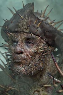
Aaron McBride: I think one of the things that concept art helps with is establishing upfront the look and overall aesthetic for what the Flying Dutchman and her crew would be. The idea being that the longer they serve, they are more infected and encrusted with sea life. It could be pieces of the ship as well, to drive their mutation. We didn't want them to look like they had evolved comfortably. We wanted this to be a curse. [Director] Gore [Verbinski] actually said in earlier meetings, even on Pirates 2 and they were fighting on the Dutchman, but then there was a whole boarding party that go over and fight on the Black Pearl. Our eyes bugged out when we found out we had to create a whole new crew in a quarter amount of the time.
It helped that we had Jeff Campbell and Steve Walton, our model supervisor and lead view painter, so a lot of our techniques were already in place. We could bang them out pretty quickly. What we did was spend a week, myself, Jim Byrkit and Crash McCreerycame up with designs for new pirates and then we put them in front of Gore. He selected six hero pirates out of that and then we fleshed out the remaining four of pieces.

A lot of things Gore and his art department in L.A. had established were stuff for Pirates 3 when they were doing Pirates 2. But expanding the crew almost twice as much as it had been in Pirates 2 came later in the game while doing principle photography with the actors they decided they didn't have enough guys to cover. The first piece of artwork I did for Pirates 3 was for the encrusted Jack Sparrow. I started out by doing some withered drawings of him. He was in the same situation in his hallucination as Wyvern, the character in Pirates 2. The idea was to make Jack very old as well. I did some sketches and we found the older we made him look, the more unrecognizable he was as the iconic Jack Sparrow. We kept him encrusted and aged him 10 or 15 years older, but we stayed away from making him over the top.
We did some early drawings to establish how much would be eaten away and how much left on the wall and then once Gore bought off on the overall body silhouette -- I did tighter overall portraits. A couple weeks passed and then that's when we got the new we had to do the ten new characters. Some of the other art was concepts for the green flash, where the boat flips.

Also, a lot of what art directors at ILM do is attend dailies to keep an eye out for areas where a character may look off model and isn't faithful to the concept the director bought off on. Also a lot was maintaining the continuity of look for the new and existing creatures. When something would look suspect, we grab a frame and paint on it for options for the vfx supervisor. If he approves it then he passes it on to the CG artist as a target look. For the maelstrom, I painted on a few frames to see if a different lighting and haze described the environment better. You serve as a note pad for the vfx supervisor, because they are so busy overseeing everything.
TDB: Are you still using traditional mediums for your concept art?
AM: We start off working traditionally with a rough sketch. If you go and render it out in Photoshop, if it's not something that the director is interested in then you've spent a lot of time tightening something that wasn't in the right direction. Once the director has bought off on sketches, then you go in and graft in textures. The capabilities of CGI are so much more sophisticated and believable; it helps in the design phase to bring it to a photorealistic level to save time in establishing a look and with time for the modelers and the painters. They have a photorealistic guide for where it should be going. But you also have to make sure the photo reference or textures you are sampling from don't dictate the design. You're willing to explore more options in terms of form and silhouette from a sketch and then once that's bought off on -- you can be photorealistic. In terms of painting on frames, when you are looking at shots and dailies, and you grab a shot that could look better, you are working in Photoshop and sampling existing colors that are already in the plate.

TDB:Is there a piece of concept art you were particularly proud of in the trilogy?
AM: I enjoyed working on the encrusted Jack Sparrow. There is also a character in Pirates 3. It's funny because sometimes you'll be rushing to get a bunch of artwork sent down to the director, but sometimes something you throw in at the last minute is something that works for the best. There was an eleventh hour design I did for a guy who was fused with a jellyfish. He had these angry, red tendrils draped over his face. I was doing it the night before and I was enjoying doing it. So we sent it down and it was one Gore approved for the new crew.
TDB: What's the single most important aspect of having concept art for a film nowadays?
AM: It's funny because a lot of the artwork we do, we use the computer a lot but in a traditional way. It helps save time. The post-production schedule on all the Pirates movies has been very accelerated. Concept art can help to establish Gore's vision at the start, so that you're not wasting time chasing down a look. When you have a view painted, a modeler and all the other CG artists, that's a lot of people that have to establish the look and if you don't have a target guide, it can be elusive. If you can establish that early on, it saves time and money. And now that we are using more digital techniques, you start with a rough sketch, then maybe do a color study and then you start working in Photoshop up until you have a photorealistic target.
TDB: Do you think a huge vfx movie of this scope and caliber could be made without concept art?
AM: I think it would be extremely difficult to leave it out of the process. At this point, it's quite imperative. You can answer a lot of questions early on in the process with concept art that you can't afford to try and answer later on. The schedule is going so quickly later on that if you can answer that question visually, that saves a lot of time and money down the line if it becomes a frustrating, sticking point. Sometimes, we have shots that people affectionately call "widowmakers," because the shot is hard to achieve. Conceptually, it's a difficult to nail down and it's for those shots that it's imperative to have concept for upfront.
Alex Jaeger -- Visual Effects Art Director, Transformers (ILM)
TDB: What role did Michael Bay want the concept art to take in the pre-production of the film overall?
AJ: This was a film that was uncharted territory for Michael and many people on the show. Mainly for Michael, the idea of having an animated character in one of his films was new for him. He had an art department in L.A. coming up with ideas for the robots and those guys did much iteration to give him an idea of what the robots would look like in robot form. He called on ILM to figure out the faces and heads, which is where most of the character comes from.
He put us in charge of especially Bumblebee, so they could be characters and be able to emote some and have something that we can relate to. Myself, Christian Alzmann and Brian O'Connell went to their art department to help flesh out ideas for faces as well as how to get these things from a car to a robot. They just dealt with the car and what it turns into and it was up to us to figure out how to get from A to B -- that's where the magic of ILM comes in.
. Initially, pen and paper were used for the concept art (right). All Transformers images © DreamWorks LLC/Paramount.")
TDB: As you are trying to come up with the physics and designs of the actual transformations, how closely did you collaborate with vfx staff to bridge that gap from paper to application?
AJ: Early on, we did a round of concept art to show the general break up and those were used as a loose base for how we were going to do things. It came down to that each transformation was done by whatever camera angle it was being shown from. When we showed Bumblebee transform from the front of the car, we focused on the visual parts of the car and how to make it go from car to robot. All of the stuff in the back just happened off camera, so they were very shot specific. In that case, we would focus on the grill and the tire and how to transition from car to robot. I would give them the model and draw on top of the model the cut lines, like the fender should split here in this many parts, so we'd have them in animateable pieces. For some, I would do a quick sketch breakdown sequence and have the tire pop out first and then the headlights next, basically guides like that and then hand it over to the animators so they could take a first stab. With that they would put a robot into a crouching pose and then a standing pose. Once they would do a first take then I would go back and give my notes on timing and believability.
TDB: Are you still using traditional mediums for your concept art?
AJ: Initially, we use pen and paper. We went to L.A. for a week to work with the L.A. art department. We went down with a couple laptops and pen and paper as most of it was figuring things out in our heads. We would scan those sketches and do some quick cleanup on the laptop. But once we were back up here and we had the models in progress, we turned digital. We used the models as the basis for the artwork so we could make sure that we using something already in progress. The concept went beyond robots to fleshing out sets and environments based on any foreground shots. It was a lot of typical ILM concept art where we get the footage they've shot.

With Michael, he can put all the planning in the world into it, but the day of shooting he might see something else, so things have to change after the fact. By that point, the production art departments are disbanded so it's up to us to figure out those changes and give him iterations quickly so they can go with the shot.
TDB: As post begins, are you a conduit between that concept phase and the CGI production?
AJ: Essentially, I'm the keeper of all the artwork that had been generated. I relay to the rest of the crew what's been done and why it was done the way it was done. It's a big part of the art direction job. We were lucky enough to have one person in the L.A. department still working with Michael, Ben Proctor, so he was right there with Michael and could relay that to me, so we were doing what Michael wanted. There were many robot changes especially in modeling. If something didn't look right, we did a lot of tweaking after the fact, but still had to stay within approved art.

TDB: Have advancements in lighting and rendering helped improve digital concept art?
AJ: Oh, definitely! Especially when it comes to matte painting concepts, a lot of times we will work with the layout artists and have them layout the camera and some rough geometry. We'll take that and Photoshop right over that, so what we are doing is very close to what will end up being the shot. In a lot of cases, depending on how detailed the concept art was, the matte painting artists may use some of the concept art in the matte painting so there's not such a huge difference to the final shot. It's good for a director because they get used to looking at the concept art.
TDB: Was there a piece of the concept work that you were most proud of at the end of the day?
AJ: I can definitely say that designing Bumblebee's head and face was my most rewarding contribution because he ended up being one of the main robot characters. He also had the most emotional range even though he didn't really speak so we had to convey a lot in the face and body language. One of the other bits on him was to try to keep close to the overall feel of the cartoon version. At first look there might be nothing that looks relatable, but side-by-side, there are a few broad things that are still there like his face is a silver color and the surround of his head is yellow. The cartoon had horns for some reason, so I reinterpreted them into panels that could pop up and down and they were a great emotional cue on him like dog's ears. Also, keeping the Mohawk with the Autobot logo and giving him a "cuteness" without being overly cute. The idea was to keep round shapes but mimicking the kind of car he was. The ears originally mimicked the headlights on a `74 Camaro.
TDB: What's the single most important aspect of having concept art for a film nowadays?
AJ: It definitely helped with budget especially with someone as detailed as Michael. The shot was always ten times more detailed, so we put all the detail into the artwork as well. I think mostly on this film, it helped because a lot of shots took a long time to get going so it kept it in mind for Michael how it would look. Between helping Michael and the crew, it helped them get a handle on the details. One of the struggles was to keep reminding people these aren't human sized robots. You can't just have a huge 30 ft tall unbroken panel of metal. It won't fly next to a human. Even next to a real car, there is a lot of high frequency detail and if the robots don't have that, then they won't look real. It was another key to the concept art -- reminding people of that.
Tara DiLullo Bennett is an East coast-based writer whose articles have appeared in publications such as SCI FI Magazine, SFX and Lost Magazine. She is the author of the books, 300: The Art of the Film and 24: The Official Companion Guide: Seasons 1 & 2.


