J. Paul Peszko talks to ILM's Christian Alzmann about the design of The Spiderwick Chronicle's Brothers Grimm fantasy world and the characters that populate it.
Christian Alzmann, visual effects art director at Industrial Light & Magic, has a 10-year track record for creating imaginative creature designs, including the giant subway-train eating worm with thousands of teeth and the head modeled after an artichoke in Men in Black II; the reinvented Wolf Man and Dracula in Van Helsing; and the alien "tripods" in Steven Spielberg's War of the Worlds
But for The Spiderwick Chronicles (opening Feb. 14 from Paramount Pictures and Nickelodeon Movies), Alzmann got to go Grimm in overseeing the design and creation of the various goblins, boggarts, fairies and sprites adapted from the children's books by Tony DiTerlizzi and Holly Black. Just the sheer number of creatures as well as their variety presented a formidable challenge for Alzmann and the other members of the visual effects team at ILM.
"This was the first kind of Brothers Grimm European-type fantasy, where there are a lot of rules to fairy tales. There are hundreds of years of stories, and they all have similar conventions. Getting really acclimated to what those rules are, because you have to treat something with this much history with a lot of respect, that probably was the challenge. Also, in the past, the images from these fairy tale movies have always been more cartoonier. They're so unbelievable that getting realism into that world was a big factor.'"

replace_caption_spiderwick02_ChristianAlzma.jpg
Did he feel the need to go back and watch some of these movies to get a handle on the rules and how you might break or at least bend them a little? "No, I've read a lot of the old Irish fairy tales. I guess it's a hobby. I've read Japanese, Chinese and all of the European ones. So, I was pretty much up on the rules. But how to implement them visually was the question. So, basically, what we did was we kept looking at nature because that's like one of the main conventions (in this film): that the fairy world is part of the natural world. We, of course, have to have good film knowledge of what came before, but usually that's more something to avoid because we're always trying to come up with something new, something that's never been seen before. Usually older films are something we have to know, but the way they look, we're trying to avoid that."
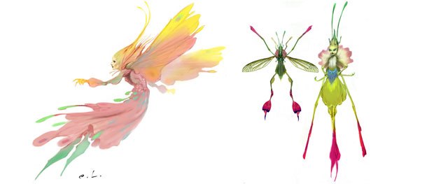
Did he have to change anything about the way he normally works on a project? In one case: yes. "One of the characters that we ended up doing was a yellow flower sprite. Usually we start with the drawing, the design. We want to start with something out of our head that's 100% imagination, and we might have something in our head that we're referencing kind of in the back of our mind. Then what we will do once we make that drawing is we take stuff from the real world, and we add that into the design to give it a more realistic quality. But that yellow flower sprite, we actually found a photo of this orchid, and we started with that photo and designed it straight off. The photo was so inspiring on its own that we just drew the character into it. We don't normally work that way."

When it came to creating the yellow flower sprite, Alzmann and his team took an unusual approach in which a photo of an orchid inspired the design of the character.
As Animation Supervisor Tim Harrington mentioned with regard to the fairies and sprites, the animation team at ILM did not want to merely create miniature humans with insect wings. So how did that influence Alzmanns work? There was a lot of finding reference. When youre on a project like Spiderwick, you have this mind set to what you are doing. So, your eyes are always semi-open to that. Even when its a weekend and youre not working on the project, you walk by a flower and say, Oh, that might be cool for a sprite.
Speaking of flowers, what about the Sylphs? A lot of creativity went into the. Their design mimics that of a dandelion seed. Their song or warning scream confuses time for all who hear it. Because of this the only real feature that we designed to be seen on their tiny little faces is their mouths. Everything else is masked off making them more mysterious. Even though Sylphs are extremely small, they swarm by the thousands making them a force to be reckoned with.
How much did DiTerlizzis drawings inspire Alzmann and how much did he feel obliged to alter them? A lot of the major design was done by two artists, Carlos Huante and Brian Kalin OConnell. They worked a lot early on with Mark Water, our director, in buttoning down the looks he was after. Mark wanted to veer a little from what DiTerlizzi had put in his book just to put his own visual stamp on things and give it a more photoreal quality. We did, of course, look at the illustrations in the book at least as a nice jumping off point. With a character like Mulgarath, you could see that he had sort of branchy tree horn type stuff sticking off of him. Of course, hes a giant ogre. A lot of that, of course, goes into the thinking of the design, but in the end, you have to work the design, so that its not so much a childrens book illustration. You have to be able to use elements that will be able to be carried off as photorealistic. Whenever we heard there would be a new character, wed get the book, wed open it up and wed see what Tony drew, and then wed present that (to Mark). Is this something you want to explore or do you want to modify it? A lot of times, we would do our own modifications of the creature, but the books were always great to have as a starting point.

The original book illustrations inspired Alzmann, but the artists had to work the design to give it more of a photoreal quality. For Alzmann, Mulgarath was a fun design because hes a big bull of a character.
What presented more challenges: pre-production or the actual production? I was on the whole length of the project. Obviously, for my job, once the pre-production part of it gets pretty settled, realizing all these elements and making it look photoreal, thats always a challenge. But, I think for me, the design is the most challenging part. Getting something that everybody likes, especially with these characters, getting something that looks like its going to be able to perform or that looks scary or that looks funny, something that can do the acting that its supposed to do as well as look fantastical or have a real small scale or large scale, thats always the tough stuff, I think.
Although he suggests that Van Helsing offered lot of monsters, what Alzmann liked about The Spiderwick Chronicles was the range in scale for the creatures, among other things. Some were good and some werent, so I guess thats probably a new experience. Also, we had just about every type of surface you could come across in the natural world from flowers and fur and wood and, of course, skin, and then we had feathers. That was a lot of different materials to cover.
What was the most fun for Alzmann? I liked the world. I think its just a fun world, the sense of mystery. Working on all these little guys, there was lots of fun stuff as far as building the characters. Mulgarath was such a fun design because hes just a big bull of a character. Our lead view painter, Jean Bolte, found some wonderful driftwood and different barks and different tree textures that we used for Mulgarath. That was a lot of fun just seeing the different resources that come into making these guys

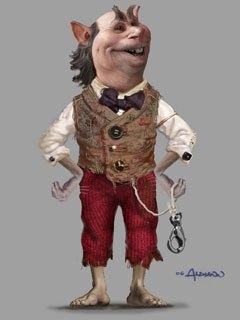
Designing Thimbletack and his transformation from meek house brownie into the boggart had to be violent, fast and angry.
And what about Thimbletack and his transformation into the boggart? Basically, what happens is that you have this really nice little, meek house brownie, and, when you anger him, he gets horribly tempered and then transforms into this big, ugly, gray frog-like boggart. So, designing that transformation had to be violent and fast, but it had to look angry the way the transformation happened. Of course, going back from boggart to brownie, hes slowing down and is a lot [gentler]. Actually, the boggart design was done at Tippett Studio, but we ended up, of course, having to create the model and paint it up. So, a lot of the skin textures were made of different things. We definitely got some frog in there, a fish belly because that was really nasty looking. And then, of course, we have the usual skin disease that we like to reference for all of our gross creatures. Hes got boils on him, and hes pretty nasty. Thats always an interesting reference search: finding the nastiest, slimiest textures.
And Alzmann reminds us that ILM did a lot of environmental design, too. The whole Griffin flight, where Byron, the Griffin, takes the kids to the magical glade, we worked on the glade design, and we worked on these different environments that they fly through to get there. That was a lot of fun. Basically, what we roughly tried to communicate was that they flew through the four seasons and arrived in spring in this beautiful green glade.
What about the Griffin, himself? Did Alzmann refer to nature at all as part of Byrons design? Byron is designed after a classical griffin being that he is half-eagle and half- lion. He has roughly a 25-foot wingspan, which had to visually appear like enough wingspan to carry three kids. We were able to visit an animal sanctuary and get plenty of useful video and a still reference of a red tail hawk. This is where Byron gets his ruddy brown plumage.

Byron the Griffin is designed after a classical griffin. He takes the kids on a magical ride in which they fly through the four seasons and arrive in spring at this beautiful green glade (r).
And what was the inspiration behind the design of the ride? A lot of that concept work was done by me and our lead digital matte artist on the show, Brett Northcutt. We did a lot of the conceptual designs where the trick was how to look at these aerial environments as something thats realistic yet a little bit magical. We wanted to get a little more magical with each new environment so that you knew they were leading somewhere special. And, in the end, we came up with the idea that since we were landing in springtime why dont we have each of those four environments come up. I think we start in fall, and then we go into summer, and then winter and then the glade is spring. Normally what you end up doing in a film is you design one environment and then youve got 20 different views of that. But it was fun to conceptualize all those different ones. And all had to be pretty and magical with all the Maxfield Parrish that we could put in.
J. Paul Peszko is a freelance writer and screenwriter living in Los Angeles. He writes various features and reviews, as well as short fiction. He has a feature comedy in development and has just completed his second novel. When he isn't writing, he teaches communications courses.


