Bradley Munkowitz and Navarro Parker talk Joseph Kosinski, After Effects and excellence in UI design.
After talking to Bradley Munkowitz [affectionately known as GMUNK to his motion graphics cohorts] for just a couple minutes, you can’t be sure if he’s talking about a HUD design or a righteous ride down a gnarly wave. His enthusiasm is infectious. It’s hard to imagine him sitting still at a computer for five minutes, let alone the countless hours his design work requires. Which is where Navarro Parker come in. He’s the one who brings GMUNK’s designs into the real world, injecting life and motion into the visual insanity.
I recently had a chance to talk to both artists about their user interface design work on Joseph Kosinski’s Oblivion, a project that included HUDs, reticles and light table design and animation. They shared with me their insights on passion for all things user interface, their digital tools of choice and the dynamics of their collaboration with the film’s director.

'Oblivion'. All images © Universal Pictures, Inc. All Rights Reserved.
Dan Sarto: Tell me a bit about the scope of your design and animation work on Oblivion.
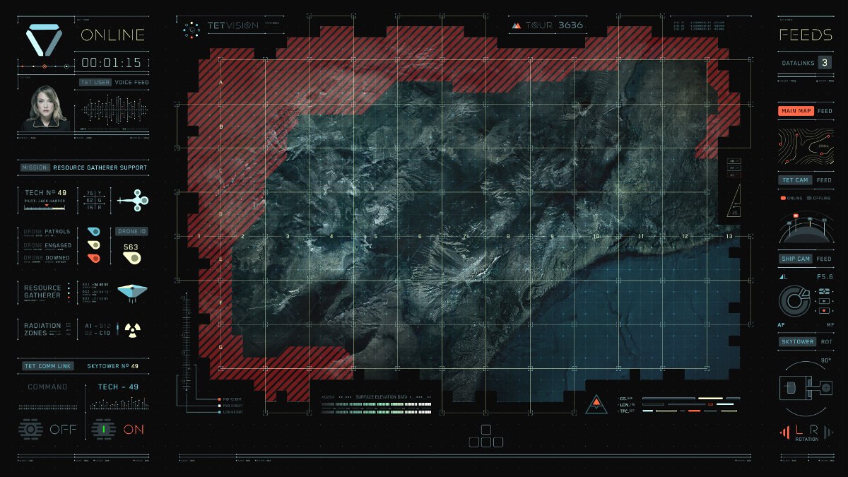
Bradley Munkowitz: The interface designs we did on Oblivion were a two-phased project. The first phase was doing the light table graphics for the Sky Tower, which was needed for onset playback. We designed for four screens that were played back on 45 inch monitors embedded in a table. We had to get our work done and rendered to be available for onset playback so they could film the graphics in-camera. There wasn’t a lot of post work done on those graphics. It was mostly done in-camera. That was about a two and a half month gig for the design and animation with a team of three.
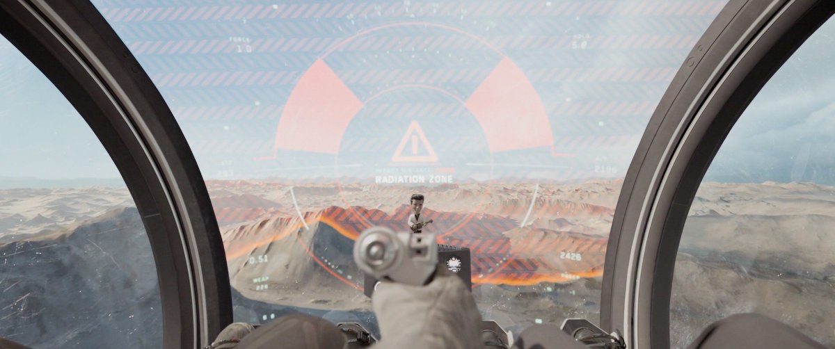
We chilled for a while. The film crew went and shot in Iceland and on a stage in Baton Rouge. Then, the second wave of work was with a team of four for all the post work, which included the HUD for the bubble ship, which appeared in around 50 shots. We also did gun reticles, drone reticles, binoculars, some motorcycle UI and a drone diagnostic device. That was a three to four month gig.
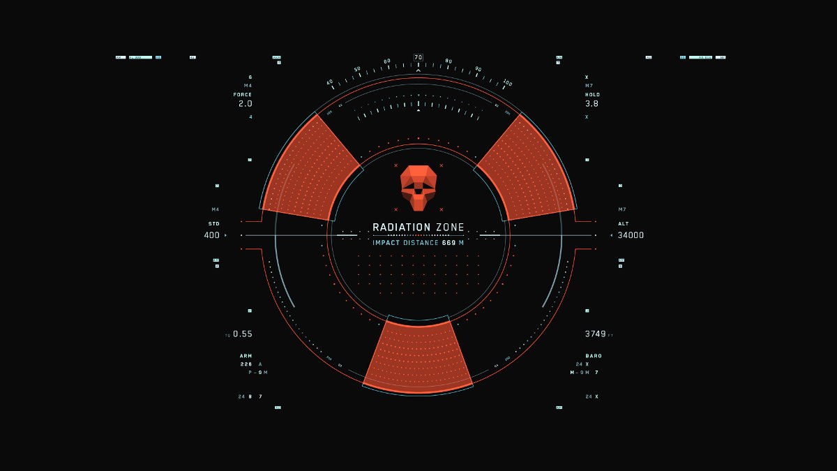
We made a really dope rad skull for the Radiation Zone UI but they didn’t use it, which was a big bummer. Our biggest disappointment in the gig was that they used an exclamation point within a triangle rather than our dope polygonal skull that Alexander designed.
Navarro Parker: My job was mostly animating, bringing to life Bradley’s amazing designs. We’d discuss his vision for a particular interface, what it was supposed to look like and how it was supposed to work. We’d break it down, do some animation tests, show them to the director [Joseph Kosinski] and go back and forth from there. Our primary tool was After Effects.
BM: Navarro was lead animator. I was the design director and lead designer. I designed all the interfaces with Chanimal [Joseph Chanimal], Jake Sargeant and Alexander Perry, who also did animation. Our team was usually four, sometimes five people, a little Seal Team as Joe liked to call us.
DS: From a design standpoint, who did you interface with on the main crew? Where did you fit within the visual development process for these interface designs?
BM: The beauty of the project and the reason why we were so efficient was that we basically went right to the director. There was nobody telling us anything except for Joe. That made it very easy. I ran the team. We’re four guys, we’re all friends and we love each other. Very loose, very open, very collaborative, very Zen in a lot of ways. We worked inside Joe’s production office. We were collaborating with the VFX editors, sometimes the set and prop designers. Mostly, it was just us and Joe working in tandem.
A lot of times you work on these movie gigs and the director is not very accessible. He comes with an entourage. You have a lot of meetings. It’s more “official” and a little more intense to be honest. But with Joe, it was very causal, very open. That’s why it was easier to do the ton of work we did.
It’s funny. When we were doing the work, it never seemed that intense. It never got that hairy. Everyone kept a really fresh attitude the entire time. But looking back on it, man, we did a lot of work!

DS: Kosinski is known for his design expertise and vision. What directives did he provide? Were you working off any previs, or other people’s design work? Did you create all the designs from scratch?
BM: Joe would sit down at our desks and sketch on a pad of paper, or he would relay what he wanted verbally to us. We didn’t have any other people or department’s designs to work from. The only thing we got from the art department was, for example, the size of the bubble ship glass.
NP: Joe had a concept for this film. He’d just come off of Tron: Legacy, which was all 3D and holograms. A very dense kind of look. On Oblivion, he wanted to do something 180 degrees from that. He wanted something simpler, more elegant.
BM: Tron was all about three dimensional holograms. Oblivion was all about elegant user interfaces of the future. On Tron, we didn’t do much UI work but on what we did, it was all weird, dataviz type 3D holograms, which was really fun.
I would love to do one more. Anyone who knows me knows I’d like to do one more, kind of like a swan song, reach out to all the ninjas out there and do a farewell to movie UI.
The ultimate quest is to crush Iron Man 2. Everybody knows it. That, in my eyes, still remains the best UI work in film ever done. They crushed it. It will probably never been equaled because the team that did that has been disassembled. It was all the top dudes working together at Prologue at one particular point in time. Every single member of the team that did Iron Man 2 has gone off to different places now. I’d want to grab all these great artists and just fucking kill it [laughs].
DS: What skills do you possess, what specifics in your background can you point to that give you the ability to “crush it?”
NP: What drives it ultimately is passion. I have always loved interfaces in movies. As far back as 2001: A Space Odyssey, which doesn’t get a lot of credit for that. This was before digital. I’ve always had an eye for any movie that had a cool interface. I’d get the VHS or DVD and watch those scenes over and over. I’d watch all the behind-the-scenes stuff. Having a passion for these groovy interfaces, whatever the reason, they just really appeal to me. You can make all these really cool interface designs actually work within the movie. They’re helping to tell a story and get a point across.
I got started in TV news doing animation with After Effects. Everything was on a really tight time schedule because the 5:00 News is on at 5:00 every day. It won’t wait if your render isn’t done. That really taught me how to get things out that look good and get done on time.
BM: My background is in graphic design and motion graphics. I started with web interface design. It’s just taken years of practice to get this all down.

DS: Do you ever get a chance to see real-life future UI designs?
NP: Between YouTube, the Internet and SIGGRAPH papers, we keep an eye out for new ideas in user interface design. But you know, it seems like everything modern just keeps coming back to the work done in Minority Report.
BM: From a usability standpoint, Minority Report is still the king. I don’t know when that will ever be outdone. We’re all geeks. We love Sci-Fi, we love to geek out on user interfaces. The Minority Report stuff was actually designed by MIT. They were thinking of future user interfaces properly, with proper usability. I was working with Michael Mann recently and was really blown away by the amount of research this guy did for the sequence we were working on. His stuff was actually “correct.”
The thing that gets us by is the amount of research we do as reference. Our team, we’ve seen every Sci-Fi movie with a good interface design in it. We know all the top UI designers in the world. Our reference library is incredibly vast. But we never do usability studies in our research. We’re doing fantasy interfaces that could work, might not work…you never know.
However, for Oblivion, for the UI on the bubble ship, we did do research with things like flight simulators and helicopter HUDs. We learned about all the different aspects of the HUD so our designs would be more real world.
DS: What are the main tools you guys use to do this work?
BM: For animating flat, 2D interface graphics, even prototyping them, we use After Effects. Navarro is an After Effects master. I would argue Navarro is one of the top 50 After Effects animators in the world. You have an idea, you rough it out in Illustrator and then you bring it into After Effects to prototype it, try it with different types of motion, different shapes, how it moves, how it reacts. It comes alive.
I’m a total stoner hippie kid who is a forgetful Wildman. But when it comes to technology, I’m so organized and so optimized, it’s a perfect juxtaposition. That part of me couldn’t be more opposite. Maybe it’s the German in my background. Without technology I’m a total idiot. With technology I’m actually quite brilliant [laughs].
NP: After Effects and Illustrator were the stars of the show. 3D seems to run on Nuke and Maya. But for motion graphics, you really can’t beat After Effects. There was a little bit of Cinema 4D. A lot of Illustrator to get that super clean vector look. We could bring Illustrator directly into After Effects and scale up to 4K resolution needed for the project. For some close-up interface shots they even wanted 6K. I’ve been burned on other shows where you design in one resolution and then they come to you and say, “Oh, we need it bigger.” If you work in Photoshop, you’re kind of screwed. By working in Illustrator, we could dial up to any resolution needed and everything would still look super crisp, super clean and not blurry.
I’ve been using After Effects since version 2.1. It’s really intuitive. With Nuke, there’s a huge learning curve. After Effects is really easy to pick up and get good at really quickly.
DS: What were the biggest challenges you faced on this project?
BM: There was a lot to do, so the quantity, the scope of work was a challenge. I’m not going to say it was an easy gig, but it was a very methodical, low stress and enjoyable experience. We didn’t burn ourselves in any way. Working with Joe and the team was an absolute pleasure.
You see these big teams and it’s almost like they have too many people. You have too many people in charge, too many voices, too many cooks in the kitchen. It actually slows things down a bit. We were a tiny team with a clear cut chain of command. That speaks to the efficiency of these small teams. We see small companies doing phenomenal work all the time. I don’t like to collaborate with too many people at one time because the process gets too bogged down and wastes too much time.
--
Dan Sarto is publisher and editor-in-chief of Animation World Network.
Dan Sarto is Publisher and Editor-in-Chief of Animation World Network.


