Mary Ann Skweres reports on vital 3D visualizations for forecasting and tracking of Hurricanes Katrina and Rita. Includes QuickTime clips!

If you have the QuickTime plug-in, you can view Hurricanes Katrina and Rita visualization clips by simply clicking the image.
Numerous fields of endeavor, from motion pictures to architecture to medical imaging use 3D visualization. Recently, it has been used both in the forecast of Hurricanes Katrina and Rita and after the fact to plot the effects of the storms on the Gulf Coast region. Three-dimensional visualization was instrumental in streamlining collaborative command and control efforts by providing realtime information about the location, path and intensity of the approaching hurricanes and accurate damage assessments after the storms in order to aid in relief efforts.
Baron Advanced Meteorological Systems (BAMS) is a company that offers weather monitoring, display systems and site-specific forecast data to more than 200 television stations across the country. The broadcast of timely, accurate information of major weather events allows members of the public in the affected areas to make informed decisions about their course of action, such as seeking shelter before a storm hits. The company uses Silicon Graphics (SGI) supercomputer technology SGI Origin 3800, SGI Altix systems and SGI InfiniteStorage solutions to run its proprietary high-performance atmospheric modeling systems. These systems are used in the detection and communication of weather events, including predicting the paths of Hurricanes Katrina and Rita in 2005. In fact, two days before Katrina made landfall, Baron Services supplied television stations in Louisiana, Mississippi and Alabama with technology and personnel to provide continued broadcasting in the areas projected to be the hardest hit by the hurricane. To aid in its round-the-clock weather coverage, CNN was supplied with BAMS VIPIR weather system. In a realtime environment, VIPIR combines photorealistic mapping, 3D graphics and forecasting data.
 and Katrina as they make landfall. The data was processed on SGI® Altix® systems. Images courtesy of Barons Advanced Meteorological Services.")
Meanwhile, the San Diego State University Visualization Center was active in the Hurricane Katrina disaster response. Dr. Eric Frost, co-director of the Visualization Center, says, We are honored to be involved in doing this. At the heart of the Centers process is the SGI Prism system, which converts data into an easily accessible, open source format that is then stored back onto servers for public access, including use by relief workers and government agencies. The data sets were used for a variety of purposes, including insurance claims, public health issues and toxic substance tracking. They were also used to determine the long-term impact of the storms on the region. Additional processing was accomplished using the GeoMatrix Toolkit from GeoFusion Inc.
High-resolution image files are extremely large. Because of the limited bandwidth available to send these huge data sets, before the use of the SGI Prism to process the imagery, they could not be easily shared. Previously, to get data from the information centers to the people who needed it, the data was printed and then physically hand delivered, but with the development of the SGI Prism, data files can be processed down to a size that can then be served up as images and sent between the information centers and first responders over a simple 2MB Internet Explorer extension. Visualizing many terabytes of geospatial data, the compute power, speed 200MB a night and large memory of SGI allowed SDSU researchers to create timely 3D fly-throughs that depicted the scope of the devastation.

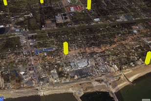
Viz Center researchers acquired data from a number of sources. The majority of the imagery data sets were taken by the National Oceanic and Atmospheric Administration (NOAA) with a specially equipped plane that shot high-resolution color photographs over the damaged area. Before photos were acquired from the United States Geological Survey Earth Resources Observation and Science (USGS EROS) Data Center and the Army Corps of Engineers. NASA provided before and after satellite imagery that recorded the widespread flooding and destruction wrought by Katrina. The high-resolution photographs were acquired repeatedly as the water drained to provide insights into the changing conditions over time as the levees broke and the water flooded and receded.
A team of image processors and computer scientists from a number of different institutions worked together on a task that normally would have taken weeks or months to accomplish. These experts included John Graham, the Visualization Centers senior research scientist, who led the processing effort and built the social network of specialists; Norm Vine, an independent contractor working with the University of New Hampshire and the Wood Hole Oceanographic Institution; Chuck Stein from GeoFusion; and numerous others. Tom DeFanti at the University of California San Diego allowed the CPUs of their SGI Prism system to be networked into the SGI Prism at San Diego State in order to speed processing of the immense data sets.

Because of an inherent aspect of the low-altitude photographs that causes the scale to be different in the center than at the outside edge because the plane is closest to the center like taking a very close picture of someone where the nose looks bigger than the rest of the face the team of experts needed to color balance and geo-rectify the aerial shots so that the pixels were placed where they actually are on the Earth. Once the photos were geo-rectified, various data sets were added as to where roads, hospitals, schools, refineries, gas stations, police and fire stations and hazardous waste were located. Besides providing a photographic record of the destructive effects of the storm, addresses could be geo-located on top of the photos to determine whether residents had a house to return to. The imagery was also used with data gathered on the ground, such as soil samples that measured lead leached by the salt water from a pre-colonial landfill. The soil sampling data was located on an overlay to show the pattern of toxin dispersal created by the floodwaters.
The capability to respond to disasters would be greatly improved with some inexpensive investments in infrastructure. Frost strongly advocates the need to continue innovation in order to provide faster access to original data, through networks such as the National Lambda Rail and the addition of 10GB Ethernet connections, especially at government facilities and research centers. Frost makes an analogy of the difference improved bandwidth would make in the event of another disaster, If you loaded up a moving van in San Diego and where going to race it off to New Orleans for relief and you went one mile an hour, immediately every one would say, Get going! This is crazy to go one mile and hour. Thats largely the response because of the network.
Having a faster network in place before the next disaster strikes would enable all major SGI facilities, data sources, visualization centers and command-and-control hubs to be connected. This would allow experts throughout the country to immediately ingest, process and serve up data sets, speeding the creation of 3D visualizations and greatly impacting the ability to respond to natural disasters in the future.

3D Nature created the terrain visualization software, Visual Nature Studio, used to model, render and animate natural and manmade environments with total photorealism. The companys programmers believed they were uniquely qualified to use publicly available data to create a visualization of New Orleans after Hurricane Katrina that would express visually, geographically and intuitively what actually happened and when. Besides creating the visualization as a public service, made available to new agencies for downloading from the web, the animation demonstrated the capabilities of their software. Chris Hanson, one of the companys lead programmers says, Nobody called us up and asked us or paid us to do it. We felt that it needed to be done to fill an information and understanding vacuum about the whole event.
After the storm, programmer Frank Weed created 3D visualizations of the progression of the water level in New Orleans caused by Katrina an accurate detailed representation of how the water inundated the area. They also attempted to determine why one area flooded when another didnt. Timeline, water height and dike height info was gathered from various sources, including the Army Corps of Engineers. Although they were not an official government agency, they were able to acquire good terrain model data that showed every little bump, even large buildings in the city.

With Hurricane Rita bearing down on the heels of Katrina, Hanson realized the potential for an enormous amount of damage to Galveston, Texas. With the view to encouraging people to evacuate before the storm hit, two days before the projected landfall Hanson created an animation predicting what could happen if a storm surge of up to 20 feet topped the 17-foot retaining walls. Fortunately, the storm veered east and hit Galveston on the best possible front, an area of marshlands heavily protected by a seawall features represented in the 3D visualization. Hanson, who had been following the television coverage, concludes the city, dodged the bullet.
With the Galveston animation, they rushed to complete the visualization before the storm hit. Without the clout of a government-sponsored organization behind them, they were unable to get data resources of as high a quality as those they secured for New Orleans. The island depiction of Galveston is about the right shape and in the right place, but it doesnt show precise local details. Hanson explains, We have done this for 13 years. During that time we made a lot of bookmarks about where to find data. In the geospatial world data is the first and worst problem. It can be very expensive to obtain if it isnt already produced. If already produced the quality can be good or awful. Its worse outside the United States because the U.S. government through various departments produces terrain and other geospatial data for their own programs. They make it available to the public at nominal cost.
Most of the New Orleans terrain model data used was publicly available and downloaded from the USGS website. It was created using LiDAR light detection and ranging technology. The terrain photos were made from a scanning laser mounted in the belly of a plane. The laser sweeps a swath underneath the plane. Thousands of times a second the laser scans the landscape while firing a short coded pulse of light that counts until that pulse is reflected back to the plane a few nanoseconds later. The time difference between when it left and when it returned makes it possible to calculate how far below the plane that spot is located. The plane carries GPS, making it is possible to ascertain where the plane is geographically at any given time so they can calculate where that laser hit. They cover an area recording these laser hits. With enough of them a surface can be mapped. Typically, at the same time that the laser scan is made, digital photos or film is also shot, then integrated with the scanned data to give not only the terrain shape, but also the appearance of the surface at the same spot.
3D Natures software accepts a huge number of file formats and converts them into a usable format. The terrain data came in latitude and longitude, which allows the program to position the data in the real world. The image data had a different set of coordinates, but the software enabled it to line up with the terrain. The team gathered timetable and other event information such as water level from whatever sources they could find news accounts, water monitoring stations and NOAA. They extrapolated a centralized list and timetable of events. When that was complete they had a solid idea of what had happened and when. Their task was then to take the dry model that they had created and add water. The software lake component allowed them to outline an area and control the placement and height of water. Textures and reflections were added for greater realism. They animated the speed of the flooding to a timeline determined by various written interviews and media accounts. The assumptions made in the animations were proven by additional data captured by NOAA post-storm.
Mary Ann Skweres is a filmmaker and freelance writer. She has worked extensively in feature film and documentary post-production with credits as a picture editor and visual effects assistant. She is a member of the Motion Picture Editors Guild.
| Attachment | Size |
|---|---|
| 2857-katrinanolafull.mov | 1007.92 KB |
| 2857-katrinanolafull.mov | 1007.92 KB |
| 2857-galvestontx20fthigh.mov | 988.77 KB |
| 2857-galvestontx20fthigh.mov | 988.77 KB |
| 2857-katrinanolafull.mov | 1007.92 KB |
| 2857-nolarita.mov | 603.29 KB |


