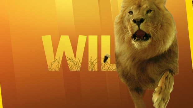
Nat Geo WILD calls on entertainment branding agency loyalkaspar to create a new network refresh and soup-to-nuts branding package, including comprehensive promo toolkits and print collateral templates, as well as a type identity and a variety of custom logo treatments.
Nat Geo WILD recently called on entertainment branding agency loyalkaspar to create a new network refresh and soup-to-nuts branding package. It included comprehensive promo toolkits, print collateral templates, as well as a type identity and a variety of custom logo treatments.
“Nat Geo Wild takes a fun and fearless approach to exploring the natural world," says Andy Baker, SVP/Group Creative Director at National Geographic Channels. "loyalkaspar helped translate our unique voice to a domestic and international audience. The branding package needed to express our distinct personality within the National Geographic family, while embracing its heritage in new ways.”
Following the design lead of National Geographic Channel Creative Director of Design Brian Everett, loyalkaspar Creative Director Anna Minkkinen and her team created a graphic system that takes the iconic National Geographic logo and remixes it. The graphic architecture of the "Yellow Border" in the package was inspired by the diagonals in the “WILD” wordmark in order to maintain emphasis on defining Nat Geo Wild's sub-network personality.
“The key to this project is finding a way to create consistency for the sake of brand recognition without losing the flexibility and diversity that is needed to relate to all the show properties,” says Minkkinen. “We wanted to create an elegant system capable of expressing the channel's passionate commitment to the beauty, color and texture of the natural world. To do this, we developed a visual style that stands apart from the parent brand by integrating elaborate CG animation with photography and dynamic type animation.”
In order to flexibly express the range of subject matter on Nat Geo Wild, loyalkaspar developed a robust visual system. This included a color palette for the various types of environments representing the programming landscape, from Arctic to Jungle, and Farm to Domestic; a modular library of textures; and a selection of animations.
"We created these toolkits to give Nat Geo Wild's in-house team organized structure to create a variety of promo elements, with the added freedom to develop and augment them as new shows come along and the brand moves forward,” explains Minkkinen. “In addition to several animation style choices, our system allows them to pair colors with textures, which we created to give the brand a stylized photographic quality."
Nat Geo Wild wanted to define "WILD" as a word that describes the animal world both in the context of nature and within a more domestic sphere, so loyalkaspar used colored backgrounds and texture to package certain programming and also built stylized environments within the WILD. The natural elements frequently pop out of the "Yellow Border," suggesting the viewers' extraordinary access to letting the WILD in.
Type identity was integral to not only distinguishing the network brand, but also inviting a global audience. Inspired by the angles in the "W" of the logotype, loyalkaspar decided the Whitney font was built for international use and echoed the personality found in the W.
"It is not only modern and personable, but also infused with a little ‘wildness’ in its use of angles where you might expect a straight line,” concludes Minkkinen. “Nat Geo Wild's seasoned team did a great job of communicating their needs and it was a pleasure working with them to create such a vibrant, dynamic system to propel their brand forward."
Source: loyalkaspar


