Stu Maschwitz of The Orphanage tells Tara Bennett what it was like collaborating with Frank Miller on Will Eisner's The Spirit, including the creation of a new digital hub called The Bunker.

The latest comicbook series to get a big screen adaptation has quite the interesting twist. The Spirit, created in 1940 as a Sunday superhero insert by comicbook legend Will Eisner, has another legend handling its translation from one medium to the other. Frank Miller, the contemporary comicbook legend responsible for Sin City, 300 and Batman: The Dark Knight Returns, make his solo directorial debut with The Spirit (opening Christmas Day from Lionsgate).
The noir, crime-fighting comics told the story of young detective Danny Colt's masked alter-ego justice avenger only known as "The Spirit." Presumably killed in the opening book, Colt is actually kept alive in a state of suspended animation which allows Colt to pursue his own form of street justice. Known for his trench coat, fedora and red necktie, The Spirit has since become the inspiration for countless contemporary comicbooks, including Miller's own motley crew of dark characters.
After Miller's success in transforming his Sin City graphic novel to the screen with co-director Robert Rodriguez, The Spirit became his next cinematic passion project. Having used complete greenscreen environments to great effect in creating literal interpretations from page to screen for Sin City, Miller decided on the same technique for The Spirit. He also went back to San Francisco visual effects company The Orphanage, which worked extensively on Sin City, to help him create this new world on screen.
Stu Maschwitz of The Orphanage was hired as the overall visual effects supervisor, where he was charged with coordinating the work of 10 other vendors to bring the film together. Reflecting back on the early discussions with Miller about the film, Maschwitz explains that he wasn't just looking for a visual effects service provider but also a collaborator on the filmmaking. "We are that," he asserts. "And that's part of why we have had such a fun relationship with Rodriguez over the years because we are a like-minded film production company as well as a visual effects company."
"Initially, the conversations we had involved our cinematographer Bill Pope," he continues. "I was brought on board around the same time he was. It was then that I realized that Frank and the producer Deborah Del Prete were really taking this film seriously from a filmmaking standpoint. The decision to bring on Bill Pope was huge. He's known for The Matrix movies and the Spider-Man sequels. But my favorite film that he shot is Bound, with Gina Gershon and Jennifer Tilly. It's a modern, noir thriller and had that chiaroscuro lighting. It's a sumptuous and beautiful film. So Bill and I sequestered ourselves for a while and had a lot of conversations about what Frank's visual style does for a viewer. It's obvious to anyone who sees his Sin City artwork, that he's the master of silhouette and telling the story through simple, bold shapes that become iconic. It was something we knew we would want to explore.
"And in addition to being a visual genius, Frank's also a literary genius and is perfectly able to describe his process. He told me about his comicbook drawing process in such a way that my jaw was on the floor," Maschwitz laughs. "He said that he writes so that he can have something to draw and he only wants to draw the cool stuff. He writes stories that allow him to only draw the cool stuff. It's still work so he makes it that he has to draw as little of it as possible. It took me like a month to recover from hearing that because it is so succinct and perfect. It's very humble, but in that humility is a perfect description of what I call Frank's visual minimalism. He tells a huge amount with a very small amount of actual detail.
"It's interesting because it's very different about what Frank observed about Will Eisner," he explains. "And it's also important to remember that there are two legendary comicbook artists we are trying to be faithful to here. Although it's a Frank Miller movie, it's a Will Eisner comicbook. With Eisner, he was able to tell a huge amount about a person or an environment with a small, surgically placed detail. Frank said Eisner could describe the entire nature of a room with a matchbook on the corner of the desk. So those were the two things we were working with: the right, quirky details and Frank's knack for making an image seem larger than life by showing you as little as possible so your imagination is filling in the rest."
Maschwitz says their mandate became about creating the cinematic equivalent of that comicbook style. "I mean that in a way to differentiate that from what came before," he clarifies. "Our movie is a stylized movie that was shot largely on a greenscreen stage. We have the great benefit of looking at 300 and Sin City, which I think are beautiful and terrific movies, to see what they've done so we can stand on their shoulders and do the next thing. To my eye, what I liked about Sin City is that it feels like the comicbook brought to life. In the same way, the 300 movie is those [beautiful] paintings brought to life. With The Spirit, Frank and Bill and I decided that instead of that we would make a movie. We would do a more traditional style of filmmaking and use traditional filmmaking tools, or the appearance of traditional tools, to put The Spirit on the screen.

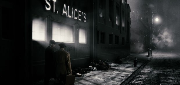
"What that means is that if we wanted to create a strong silhouette or a signature Frank Miller image, we would devise a photographic plan to get there. And even if that photographic plan was going to be a collaboration between on-the-set cinematography and digital environments added in post, we were still thinking about it in cinematic terms. For example, in the trailer you see a lot of outdoor night exteriors, where the Spirit [Gabriel Macht] and the Octopus, played by Sam Jackson, are fighting in a muddy environment outside the city. You'll notice there are pure white backgrounds, and they seem to be counterintuitive in portraying a nighttime environment. But it's foggy and it's snowing and if you put a strong rim light behind an actor in that, you will light up the air around them. The air itself is a light source and so we could do these Miller-esque things like have a big, white, blown out section of sky bleed into Sam's muddy face. The result is that the form itself becomes less factually distinct and you only see from eyes and expression and a strong simplified form. We made it so that we could just as easily silhouette someone against white as against black and emphasis the silhouettes. It's the ultimate hat trick that Frank pulls off with his artwork. He fills in the silhouettes to the point where you need to use your imagination to fill in the details. In cinematography, it becomes a huge amount of work to achieve that visual simplicity. But it actually works in your favor when you are creating the backgrounds in CG because visual simplicity should be more efficient to execute, but the problem is that it's really, really hard. Anyone who has tried to decorate their living room in mid-century modern style can attest to how difficult it is to do minimalism well. It would be very easy for a black background to feel cheap but if it's the right thing emotionally for the scene, then it won't feel cheap. It will feel like exactly the right choice as it often does in Frank's artwork."

In pre-production, Maschwitz says they used Miller's artwork to guide their visual plans.
"The greatest luxury that we had on this movie is that our director is the world's best storyboard artist. I say that jokingly because Frank is famous for saying that he doesn't want comicbooks to be looked at like storyboards, but he was making storyboards for this movie, so I think it's OK to say that," he chuckles. "We owe a lot to Frank's storyboards in terms of giving us inspiration. In fact the whole process began with an animatic process done at The Orphanage where we turned Frank's storyboards into previs sequences for all the major action scenes in the movie. They were all hanging on the wall, gorgeous, beautiful pieces of artwork. Each and every one of them was drenched in storytelling and emotion. We looked at the way he would draw the Spirit's black trench coat and sometimes draw the underside of it so lit up by the city lights below that he would draw it in pure white and it would blend into the snowy sky background. Bill came up with the idea of having a special version of the Spirit's wardrobe created where the inside is white so he could hit it with the light and push towards the silhouette much more quickly than if it was black."
Making the iconic Spirit wardrobe pop was an important part of the planning too. "The Spirit's only costume conceits are his mask and his tie," Maschwitz explains. "Everything in the film should feel photographic, but the tie is the one exception to that and it's for a very important story reason that is explained in the origin part of the story. But the tie gets this special treatment, which is what we call the 'comicbook spot color.' It flattens out a little bit and loses some of its photographic quality. Again in collaboration with wardrobe, and this is something that Rodriguez did to great effect on Sin City, we created color-coded costume and makeup decisions. The tie was red but it was fluorescent red and we would have ultraviolet lights on it to cause the tie to live in its own lighting world. The Spirit could be completely silhouetted but his tie would still be lit up."
But probably one of the most distinctive, and perhaps industry changing, aspects of The Spirit was The Orphanage's progressive approach in creating a truly seamless post process. Maschwitz explains, "A couple things that we did on this film came out of ideas percolating at The Orphanage for a while. This film turned into the perfect way to put those ideas together for a division of our facility that we call The Bunker. It's the idea of the digital hub for a movie that needs to be worked on by more than one visual effects vendor. Traditionally, the studio hires the visual effects supervisor, who then distributes the work to vendors and then reviews shots out of a double-wide trailer or a cramped office on the studio lot somewhere, usually on their own laptop or a cobbled together system. I have the luxury of having my own facility as my home base so I couldn't imagine doing it that way. We proposed this model for the film called 'The Bunker' where The Orphanage would not only manage and distribute the visual effects work but would also be on-lining the film in our DI suite constantly throughout the entire six months of visual effects production."

Detailing the process, he continues, "As we were reviewing the shots, we were reviewing them in the context of the ever-evolving cut of the movie. We'd get EDLs passed up from creative editorial in L.A. and we would stay in synch with the current cut. Every submission from every vendor would get dropped into a full 2K timeline that was being color-graded on the fly. In that sense, we merged the DI process and the visual effects shot review process into one, as opposed to the traditional, and painful way of doing it, which is that you final all your visual effects shots and then you go into the DI. This was the ultimate win/win of post. We not only achieved a huge amount of efficiently, which enabled us to do 1,900 shots on a budget in six months but it was the right thing to do creatively for the film. The look of the film is so significant and we weren't making decisions blind. The technology backbone is such that we can pre-color correct a shot and compact that into a look-up table which we can share with the vendor. The vendor can bake that color correction into their QuickTime dailies that we review using cineSync software, but then they can deliver the shot to us uncorrected and we can reapply that correction in the DI so we have the ultimate flexibility to change it if we want to. But we also have a trust relationship with the vendor and they know that the way we have been looking at the shot the whole time is a faithful representation of what it's going to be. That process started even before the shoot when Bill and I put together three different test shoots. We shot the movie on the Panavision Genesis camera and they make a box that plugs into the camera and applies a look up table in realtime. We actually developed the signature color correction of the movie before we got to the stages in New Mexico. We were able to load that look up table, called the Mash 4, on the set and every monitor on the set was showing a color-corrected version of the scene. Of course, we were recording the raw, analog matte that the Genesis creates, but previews were an accurate color correction plus a film out emulation. Whatever anyone saw on the set was 100% accurate to the version of what was going into the theater. We even went so far as to build into that look up table a greenscreen suppression so in the monitors you saw gray, black or white."

Maschwitz says The Spirit ended up being the ultimate testing ground for The Bunker. "We had done enough with it before to know that it was the right thing to do. We had done a Bunker film before with You Don't Mess with the Zohan. But mostly the eye tools we had been using in commercials as my day job is directing commercials. I make exceptions for Robert and Frank because I love working with them but I am a commercial director for commercials with visual effects components. I had long wanted to tie the color correction process more intimately to digital effects production in commercials. So I was able to make a presentation to Frank and Bill that we knew what we were doing. The Orphanage was doing DI before it was called DI. We had a service called Magic Bullet, which is now a software product. At the time it was a proprietary service where we would color correct and film out independent feature films that were shot on the earliest digital cameras. In fact, my Associate Visual Effects Supervisor Aaron Rhodes was the Magic Bullet colorist from day one at The Orphanage. He was on the set with us everyday on The Spirit, largely doing my job because I was second unit directing on the other stage most of the time. Then he stayed with us through post as the DI colorist. It was a rare opportunity to have your colorist present for every single conversation with the director and cinematographer, and to know the intent and the backgrounds. He not only had the eye to manage the color consistency but the technical knowledge to create look up tables and distribute them to vendors."

The Bunker also allowed Maschwitz to keep his eye on the creative priorities. "Again when you are trying to be efficient from a cost standpoint but also push creative boundaries and engage a facility as a creative partner, not just as a vendor, the ability to so quickly get past the usual technical "gotchas" meant that we could immediately get down to the creative decision making that was so important on this film. There are no enormous creative challenges on this film, just enormous aesthetic challenges. Those are the challenges that interest me the most. I'm an anomaly. I'm not interested in the technology. I understand it well but I feel like it's my duty to know it so I can get it the hell out of the way. My pitch to Frank and Deb was that you want someone that knows this stuff so well that he can forget about it. And I think I was able to explain, hopefully in a way that wasn't completely sucking up, that everything I felt that I knew about filmmaking and composition I had learned by reading Frank's books in film school."
In the end his pitch worked spectacularly. "A special aspect of this show was that I felt like I managed to synch up with Frank visually and guess what he would want. We had an extraordinarily high rate of success with client finals on this show. In one week there were 451 client finals. And yet the way that The Bunker was run was so smart and efficient thanks to Nancy St. John, our visual effects producer, who orchestrated the production backbone. The Bunker crew only worked one weekend with no long hours. We had very densely packed days that were split between shot reviews with the vendors and then high-res reviews. As the DPX final candidate shots started to come in, we would review them in context in the DI using our FilmMaster system. Every day I sat in the DI suite looking at the same screen, switching between the Mac cineSync and the FilmMaster system, looking at the same big screen projection whether it was the half res dailies QTs or the full 2K final film. The experience was luxurious. So often, as a visual effects supervisor, you spent a lot of time waiting to be shown something or asking questions which creates a lot of head scratching and research. For us, the entire film was conformed in the FilmMaster system in layers. The bottom layer was the greenscreen originals so at any point in realtime I could get back to the original layer. Plus the guy running the system was the guy there when it was shot so he could help. For me, to be able to personally supervise 1,900 shots in six months and never stay late or work a weekend is unheard of. I realize that not every movie is going to be so well situated to take advantage of everything that The Bunker does, but this system of integrating DI, even if we didn't do the final DI, it still would have been smart. We're doing it on several movies now, including John Woo's Battle of Red Cliff."

The other large part of The Spirit post puzzle became coordinating the efforts of the 10 vendors. Maschwitz utilized the talents of R!OT, The Orphanage, Digital Dimension, Fuel VFX, Furious FX, Ollin Studio, Entity FX, Rising Sun Pictures, Cinesoup and Look FX. "From day one, we were able to distribute to them documentation on the color pipeline. We sent them a huge package of sample frames, look up tables in every conceivable format, detailed instructions on Shake scripts, After Effects projects, Nuke projects, everything they could have in whatever their pipeline would require so they could be productive from day one. But it was interesting because we found the vendors were not accustomed to getting a bullet proof document. Some jumped right on it and some scratched their heads but it was better to have that conversation early rather than later which so often occurs.
"And in selecting the vendors," he continues, "we booked a suite at SIGGRAPH two [years] ago in San Diego. We knew everyone would be in the same place so I spent the week interviewing potential vendors and supervisors. By the time we made selections, we not only had a sense at who would be good at what, but a personal connection and face to face relationships. It's so important to have that because you spend months on the phone. We are based in San Francisco and we had vendors based in Los Angeles, Montreal, Mexico City and Australia. And it was an amazing group of vendors. We treated The Orphanage as a vendor. They had their own visual effects team and supervisor with Rich McBride. We had David Jones at RIOT, who did a huge number of shots. He is immensely creative and I was lucky to have him on the project early. Fuel in Australia did a huge number of shots with their supervisor Dave Morley. I couldn't have done the movie without him. They were there to help me with the ongoing challenge of what this movie looks like. I did not have all the questions answered and so we worked thought it and Rich had a concept group that helped a lot. With the quantity of work, every facility brought their A-game."
Tara Bennett is an East Coast-based writer whose articles have appeared in publications such as SCI FI Magazine, SFX and Lost Magazine. She is the author of the books 300: The Art of the Film and 24: The Official Companion Guide: Seasons 1-6.


