Alain Bielik gets the jump on The Incredible Hulk by speaking with Rhythm & Hues.
In 2003, Universal released Ang Lee's adaptation of The Incredible Hulk, one of the most popular and enduring Marvel superheroes (titled Hulk). Five years later, Universal has released yet another version of The Incredible Hulk (which opened June 13th). This new Hulk movie is actually a "let's start from scratch again and do it right this time" concept. That's because Lee's cerebral approach did not wow the fan base.
Five years later, Marvel Studios is trying to re-launch the franchise on its own -- Universal is only distributing the movie. French action specialist Louis Leterrier (The Transporter) directed a brand new cast, featuring Edward Norton as Bruce Banner/The Hulk, and opted for a completely different approach to visual effects. In 2003, Industrial Light & Magic created some 600 effects shots. In 2008, VFX Supervisor Kurt Williams and VFX Producer Paul Molles oversaw about 800 shots produced by seven different facilities. Rhythm & Hues (including R&H India) produced 224 character animation shots, plus 10 composites, while Hydraulx realized 248 shots featuring complex composites, CG environments, CG helicopter and a full CG Abomination transformation. Other key vendors included Soho VFX (114 shots -- composites and CG environments) and Image Engine (75 shots -- blood drop shot, plus a CG environment for Rhythm & Hues). Lola VFX, G Creative and X1 also worked on the project.
One of the first issues to address was the original Hulk movie and its many years of visual development. "We viewed Ang Lee's film with a lot of respect, especially as it related to the visual effects work," Williams notes. "There were several new goals from the beginning that we thought would improve the character in our movie. Louis' style of filmmaking is dramatically different, and stylistically our film was going to be different by virtue of that. From day one, we decided to redesign the look of The Hulk to start. We returned to a lot of the original material from the comic books and felt like we needed to push the character visually and behaviorally, giving him a greater range of emotions. In order to do that, we needed a new look for the character making him more accessible to the audience visually. Banner's character arc in the movie would be complete by maximizing the thread between Banner and Hulk.
"We hired Aaron Sims to do the initial design with direction from original artwork from the comics and a basic wish list. His eyes were a huge focus because we needed the audience to be able to read his emotions and see Banner's inner struggle through expression. So, we lightened the eyes and made them very reflective. Once the initial design was complete, we delivered the 3D model and textures to Rhythm & Hues for rigging and design. Our approach allowed us to import Aaron's work into the R&H system, complete movement studies based on low-resolution geometry, and see where there were technical conflicts or aesthetic changes in the body after we see him moving in the motion capture movement studies. R&H would make some changes very quickly based on these studies, and the model would go back to Aaron to finesse textures, very specific facial shape changes, and refine his hair and be able to see a rendered version while R&H was building and rigging the character. We would re-inject these changes back to R&H and repeat until Louis and Marvel were happy."
Creating a Brand New Hulk
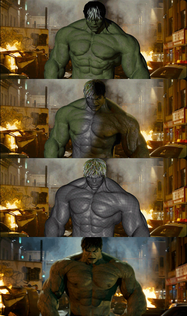
In charge of creating both The Hulk and his arch nemesis, Abomination, Rhythm & Hues mostly used a proprietary pipeline to produce the shots, except for some modeling in Maya and effects in Houdini. The team included Digital Supervisor Mark Rodahl, Modeling Supervisor Brad Sick and VFX Producer Dan Foster. "Louis and Marvel had a whole look book collected of their favorite images from The Hulk comics," recalls R&H's VFX Supervisor Betsy Paterson. "Louis wanted Hulk to look lean and mean, not an ounce of body fat. Ropy, striated muscles and a lot of subsurface detail in the skin were also on the wish list. And no purple stretchy pants! The level of detail required on these characters was extreme. A core group of modelers, texture painters, lighters and riggers worked for over a year to create every pore, muscle striation and speck of dirt and sweat on both characters. All of the detail had to be dynamic as well, with the blood pumping and flushing through his skin, and every muscle and wrinkle able to organically come and go."
The filmmakers faced the same problem that plagued the 2003 version: how do you make a giant green human being look realistic? Creating a believable giant is already a challenge, but... green? Once again, a new approach was selected. Leterrier's priority was that the skin felt natural in its environment. In order to obtain that, Production Designer Kirk Petrucelli provided snapshots that defined the tone of the locations and environments. Early textured versions of Hulk were placed into these environments and helped drive the look in a variety of lighting conditions. Leterrier and producer Kevin Feige wanted to find a balance so that he wasn't too saturated. The team tried a variety of gray-green coloration and added a bit of dappling and irregularity to the skin, so it felt natural and the character wouldn't feel like he was glowing. The skin textures, as well as muscle flex and vascular details, proved to have a profound over all effect on the feel of Hulk in a scene.
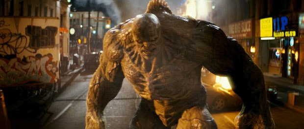
Facing Hulk in the movie is the Abomination, the result of a biohazard experiment on KGB agent Emil Blonsky (Tim Roth). The team began with the original material from the Marvel comic books. "He's a gamma creature too, and we wanted a visual physical thread between the two characters," Williams says. "It was also important that we made him a formidable character in size and look that would truly make Hulk an underdog. Abomination would be 11-feet tall, compared to Hulk's nine feet. We also made a conscious decision to make him less serpentine than in the original material. Stepping off of some initial design work from Crash McCreery, Aaron Sims helped us create a character that had iconic lines, but would live up to his name. Although we maintained some of the gamma color from Hulk, we adopted the philosophy that Tim Roth's transformation would be a bit more haphazard and gnarly compared to Hulk. We decided that his skeletal structure would have grown in an irregular way. Parts of his skeleton would literally grow to the outside of his body, exposing bones and some tissue as a result. This gave us a much 'harder' look on the exterior of his body to contrast Hulk in both size and texture."
Hulk's impressive muscle system was made up of a combination of deformations and texture driven displacements. Rigging Supervisor Matt Derksen worked with Lighting Supervisor Greg Steele to develop a system that allowed the displacements to automatically drive in and out, based on the animation of the body. An additional layer of deformation and displacement controls could be keyframed by animators for shots when the muscles needed to be pumped up to 11.
Abomination's skin was a great deal more transparent, and his bones closer to the surface. That created extra challenges in the deformations and the subsurface detailing. "The skin was built of the same type of layers as Hulk's, but the subsurface and muscle/bone structure underneath needed to be much more detailed, as the top layers were transparent," Paterson explains. "Both characters were built using a structure of subsurface detail, covered with a diffuse layer, representing the detail on the surface of the skin. There were also several displacement, specular and reflective layers. The two characters had at least two versions of most layers, representing relaxed and flexed states. Abomination had an additional 'outer skin' layer, which was basically his shredded leftover human skin. We were going for a 'beef jerky' look for the surface underneath."
Animating a Nine-Foot Tall Superhero
Most of the animal characters that Rhythm & Hues had created over the last few years have had skin sliding over muscles. The Incredible Hulk presented an additional layer of challenge, however. "With animals, we usually have fur on top of the skin, so not much displacement is necessary," Paterson continues. "Both Hulk and Abomination were highly displaced however -- not only that, we actually needed several layers of displacement that slid differently. Some of the displacement needed to travel with the top layer of skin, and some needed to remain stuck to the muscle and bone structure underneath. For instance, wrinkles travel with the top layer of the skin, but veins tend to stick closer to the muscle layer. Solving these challenges proved quite memory intensive, with several different models and many layers of maps needing to be generated for every frame. When you add in the pants on top of that... The average render times for Hulk ended up being about 10 hours per layer, per frame. Hulk was made up of a large number of rendered layers, controlled in the composite -- probably an average of 20 layers, depending on the number of lights in the scene."
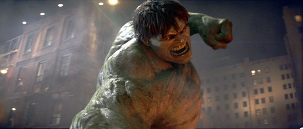
For Hulk's motions and behavior, the team started from scratch with a fresh approach. To begin with, the character wouldn't fly this time... Leterrier wanted Hulk to be much tougher looking, much more of a street brawling Hulk, while Abomination had to be sinister, more feral and predatory. Animation Director Keith Roberts and his team began to do animation studies of both characters and experimented with different motion capture performers. Ultimately, four performers were used, each with their own style of motion, which led to critical decisions as whom to cast not only to the character, but to the distinct action too.
For the body, the team used basic motion capture techniques. "We re-targeted the data ourselves, so we could control the balance and distribution of the data accurately over the joints," Roberts observes. "We did have the problem of the characters being different sizes than the motion capture actors, but we got around this with the help of the realtime playback of the motion capture system. Our actors could see their own avatars, allowing them to alter and offset their motion on the fly. I realized early on it was more important to get awesome motion rather than super accurate motion; we knew we were going to be doing considerable work to the motion later. In the end, we used the motion capture data mostly as (incredible) reference. It was important to rebuild the motion, so we could get better weight and flexibility and have the characters look larger than life. We also needed to add texture in the timing, i.e., we sped up and slowed down different parts of motion capture actions to give them have more impact, to make them more 'superhero'. For the face, we initially were planning to use motion capture exclusively, and we developed a very sophisticated method based on data we received from motion capture experts Mova. The data gave us extremely useful information on how to structure the facial rigging. In the end though, the faces were mostly hand animated using motion capture of Edward Norton and Tim Roth as reference, due mainly to creative choices by the director."
Once the basic motion of the CG characters was in place, the animation and effects teams had to create believable interactions with the scene. Everything that Hulk and Abomination touched needed to be rebuilt in the computer. Much of the interaction was handled with procedural simulations. Special pipelines were created for each type of ground interaction, bouncing back and forth between in-house animation software, Houdini for the simulations, and then back to in-house software for lighting and rendering. The team also created highly detailed models of a Humvee and a police car, both inside and out. All major parts needed to be separate and rigged to be crushed individually. The ripping metal pieces were handled by a cloth simulation technique written in-house.
A Tough Transformation Scene
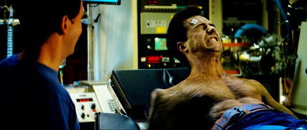
For Rhythm & Hues, the Hulk transformation scene presented the toughest challenge in the entire project. First, the physical Norton had to transform into a CG version of himself, and then into the Hulk. "Edward performed the first and last parts of the scene in place on set," Paterson recalls. "We needed to do an extremely precise 3D track of his body in order to begin the transformation. Louis and Edward really wanted the transformation to feel physical and logical. Not to mention painful. We spent a lot of time working up a sequence of events that felt consistent, rather than just a lot of thrashing around and inflating. It required a great deal of additional texture painting and detailed to rigging to pull off."
The scene posed a particular conceptual challenge: the characters' pants must remain partly intact, although the rest of the clothes are ripped apart... "It was the hardest thing in a way to face, because it's a jump in logic," Williams acknowledges. "We found a final look for them based on Banner's wardrobe, and made sure Banner was wearing pants that were a bit too large... After that, we didn't dwell on the physics of it. It definitely falls into the 'just make it look cool' category!"
More to Come...
From the beginning, Leterrier's and Feige's goal was to create iconic characters that paid homage to some of the original material. "The look and textures of the characters were treated as if we were creating CG humans, with the details in animation supporting the story," Williams concludes. "We created iconic characters that the audience can relate to and enjoy watching. Physically, they live up to their representation from the original material with a set of physics that seem real, but extraordinary. It allowed us to culminate the film with 'the biggest bar fight in history', as Louis wanted. We also created characters with a tool set that can exist in many movies to come. So, watch out!"
Alain Bielik is the founder and editor of renowned effects magazine S.F.X., published in France since 1991. He also contributes to various French publications, both print and online, and occasionally to Cinefex. In 2004, he organized a major special effects exhibition at the Musée International de la Miniature in Lyon, France.


